Death Row Records
2024
Stellar Hawk
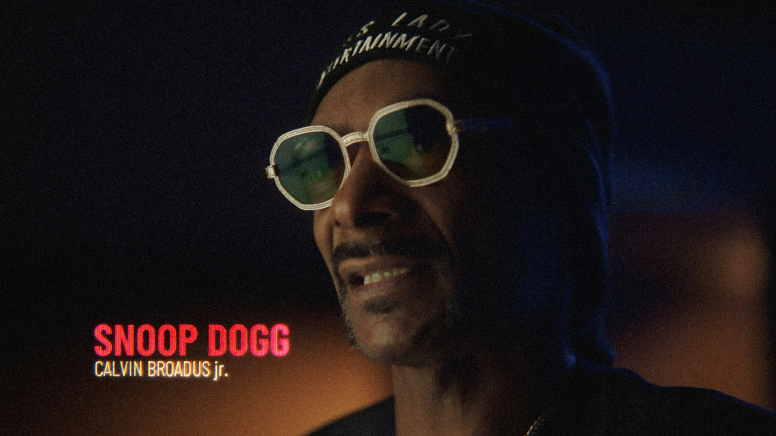
Joe Vaccarino knows my love for West Coast hip-hop runs deep, so when the chance came to craft the visual identity for a seminal documentary series on Death Row Records, he knew I was ready to dive into the crates. Death Row isn’t just a label; it’s the definitive architect of the “gangsta rap” sound. Founded in 1991, it launched a cultural revolution through the voices of legends like Dr. Dre, Snoop Dogg, and 2Pac redefining the global musical landscape.
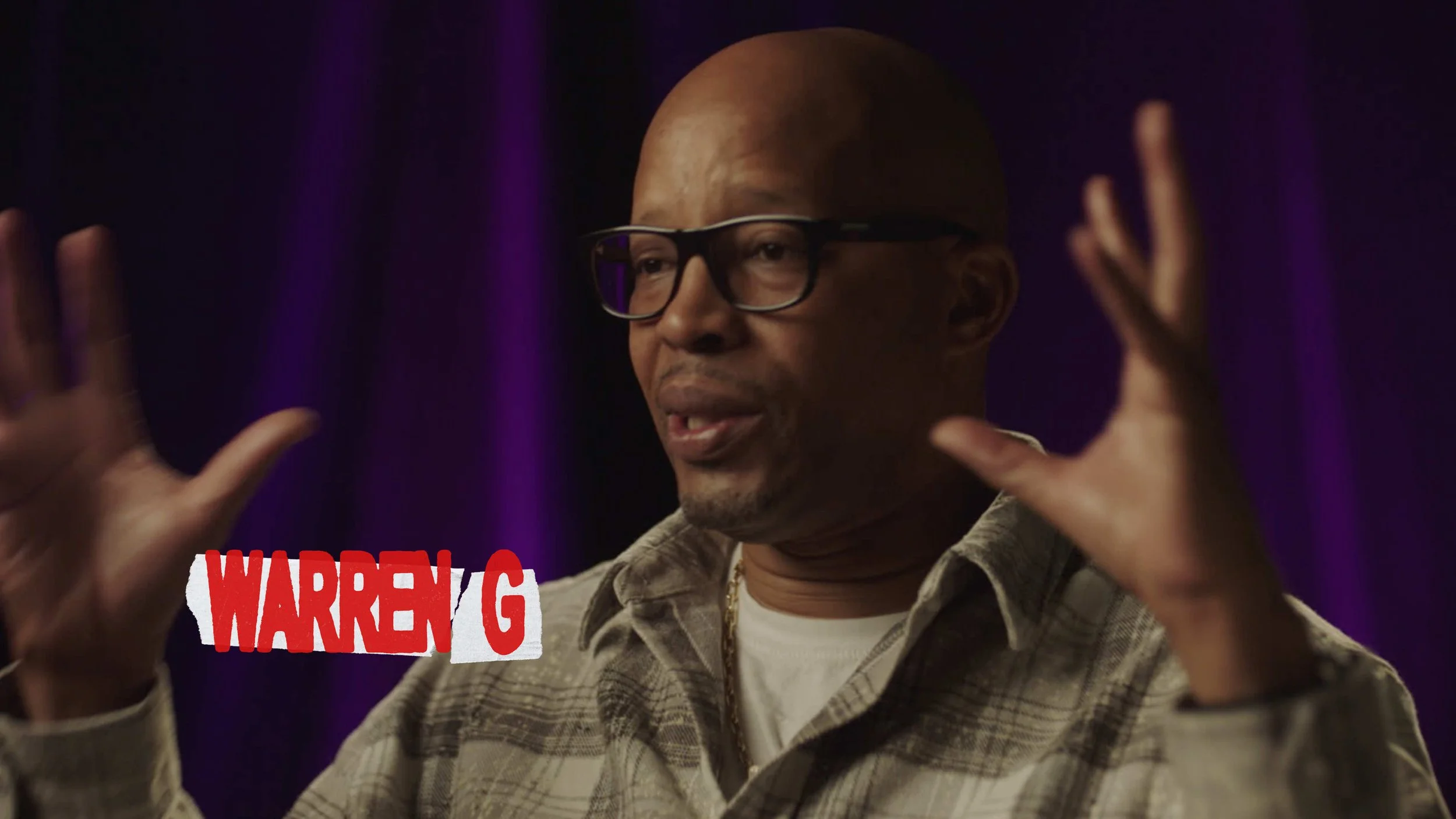
To match the raw, unfiltered stories told by icons like Warren G and Snoop, I steered clear of anything over-polished. My goal was to build a “visual journal” that felt like a curated time capsule from the early 90s. I obsessed over tactile details: the grain of a contact sheet, the magnetic glitch of a worn-out VHS tape, and the high-contrast grit of a xeroxed flyer. The result is a style that feels like it was pulled straight from a late-night studio session.
By focusing on the practical isolation of physical ephemera, we bridged the gap between archival footage and modern-day interviews. It was a true passion project to give a visual voice to the untold stories of an era that shaped my own creative DNA.
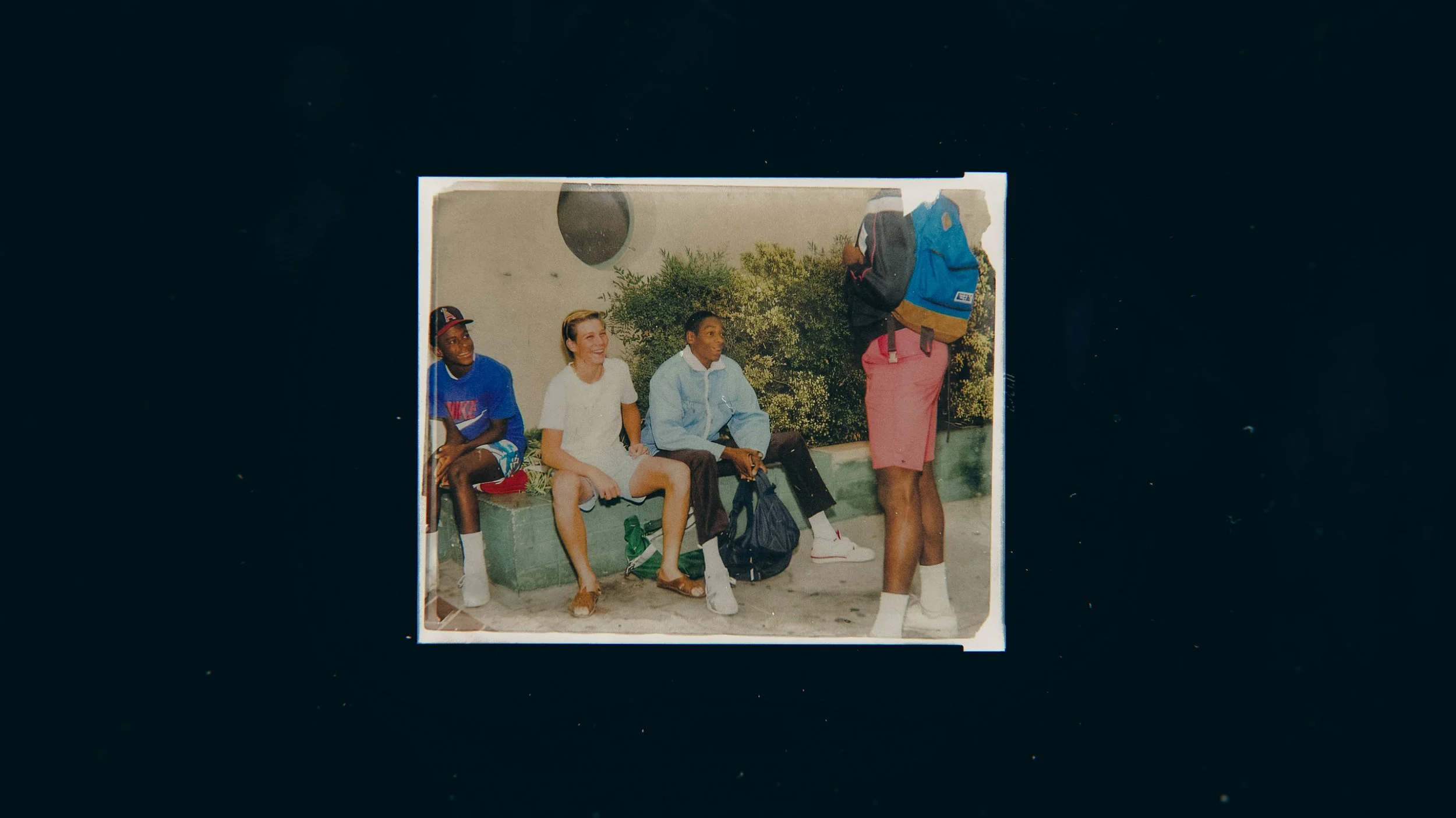
Portraiture
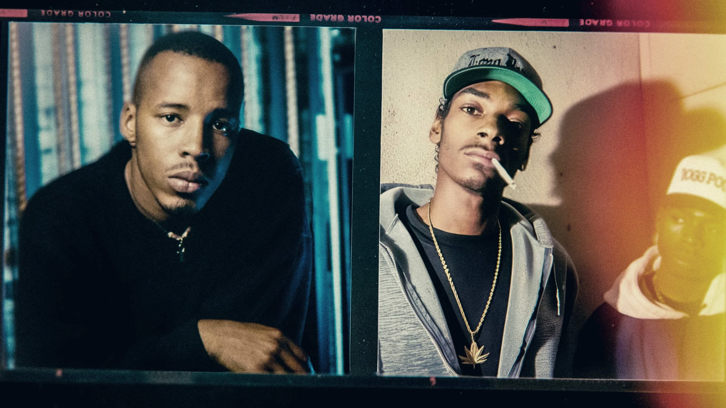
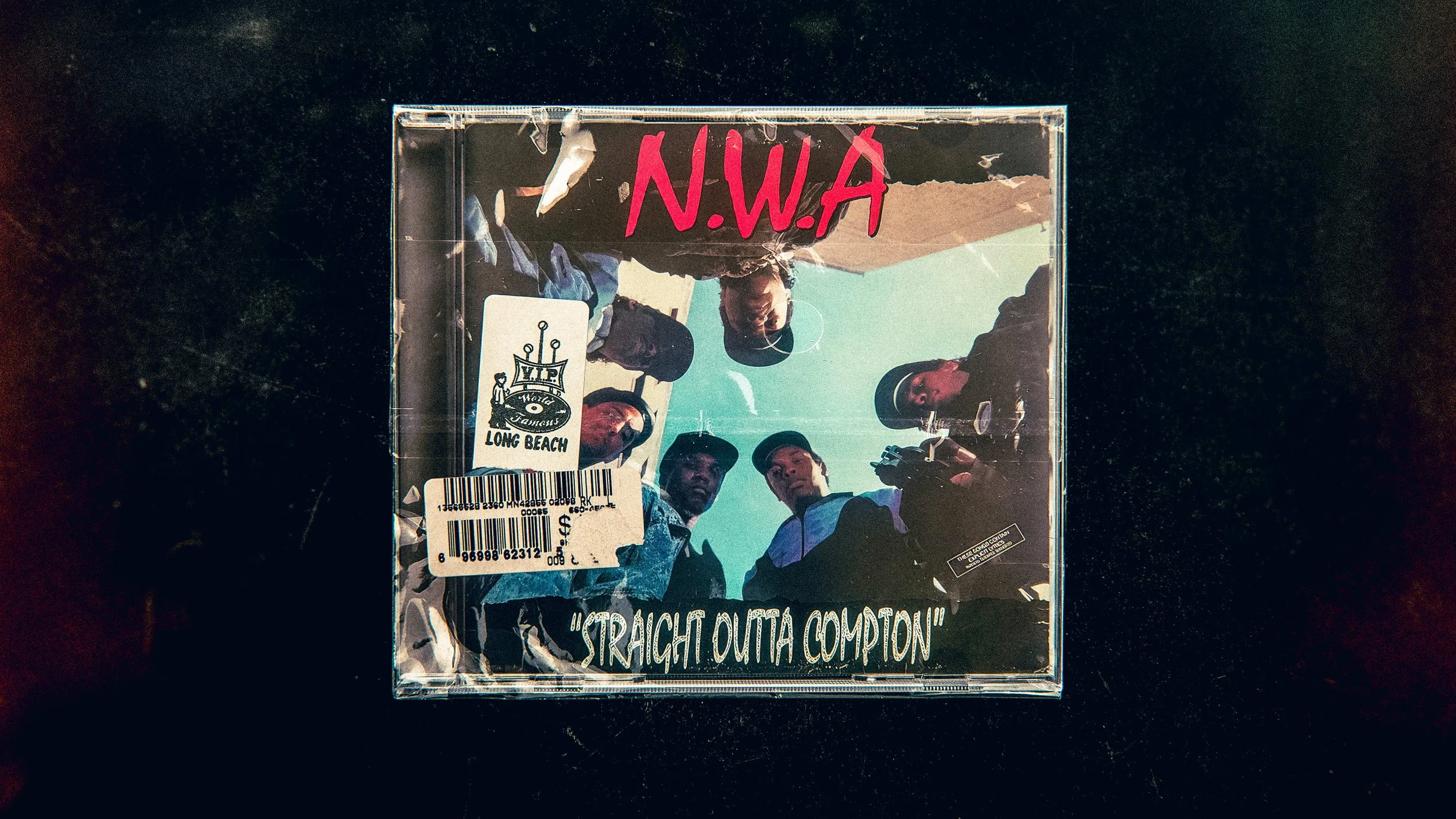
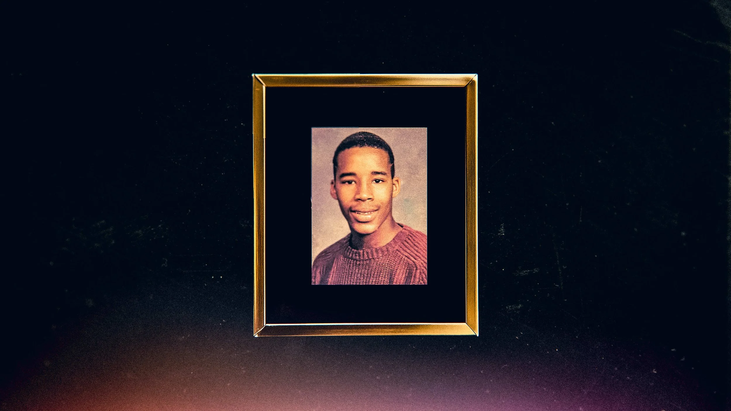
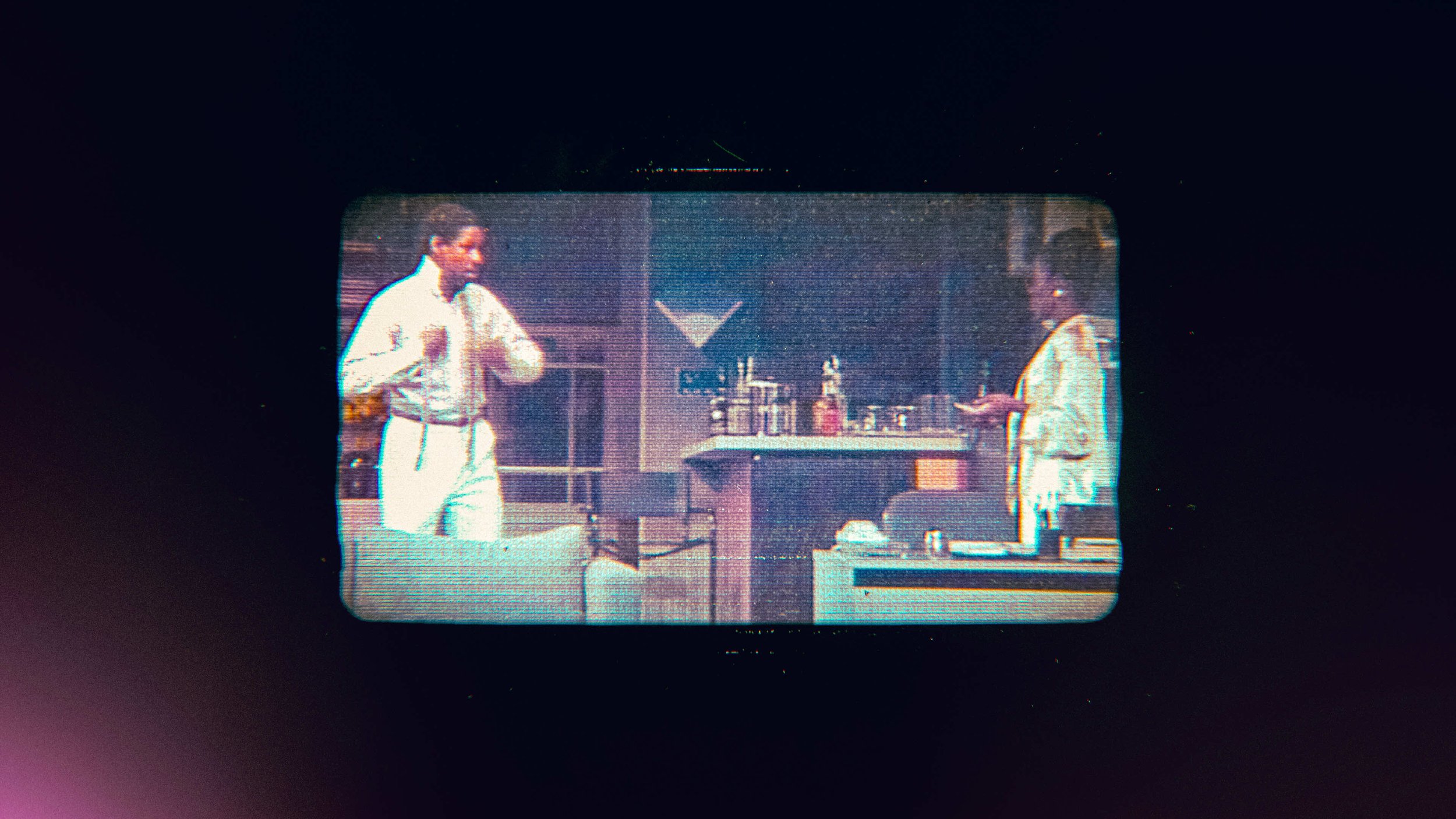
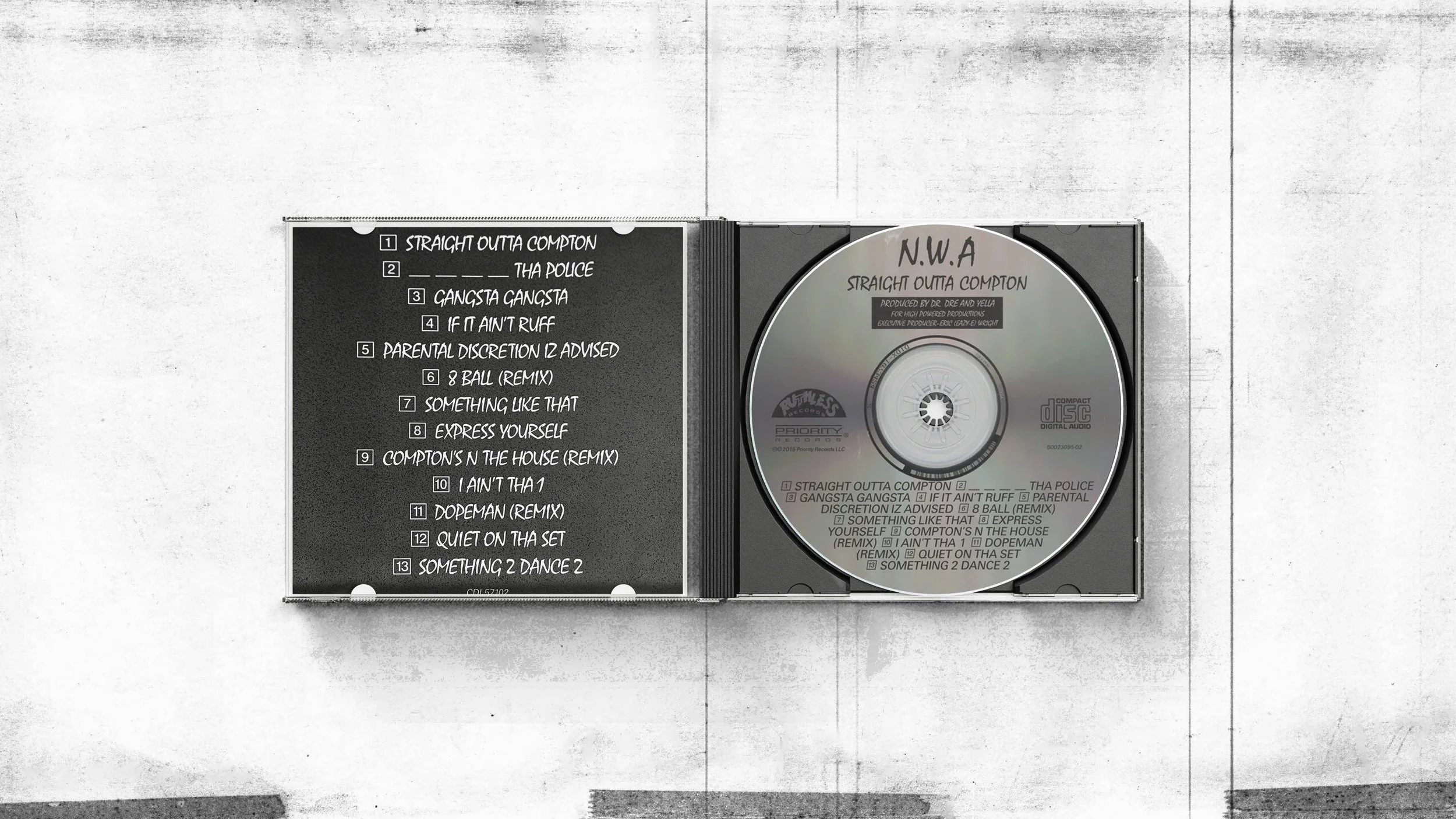
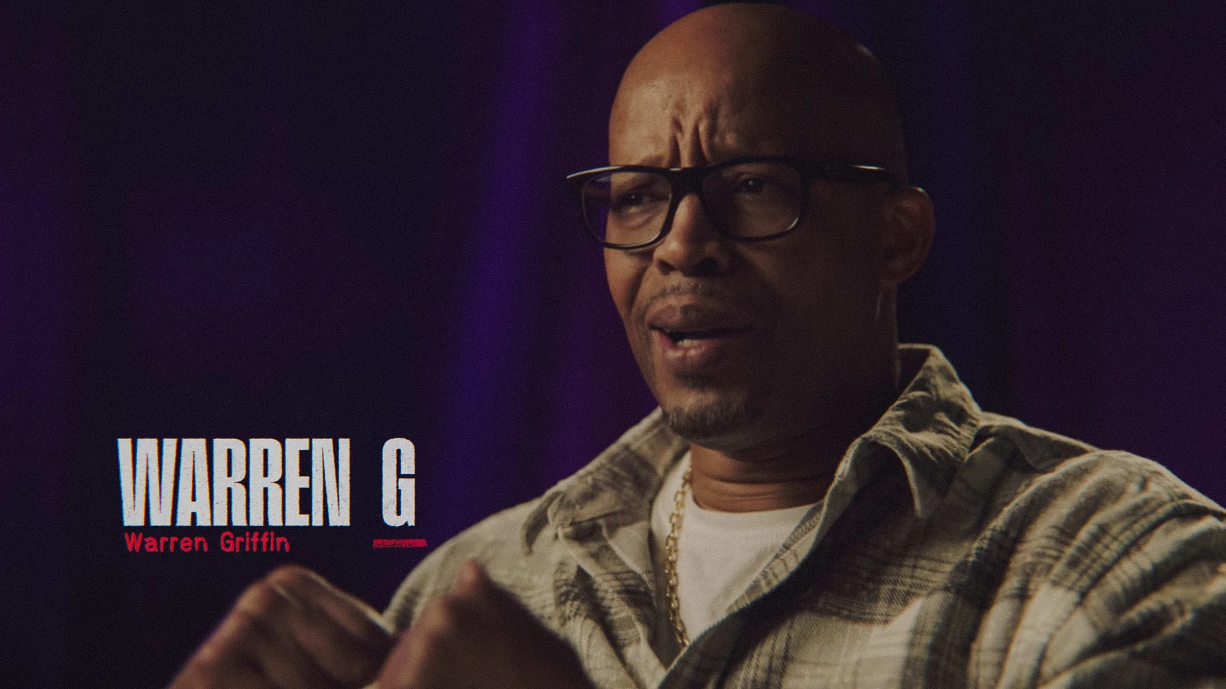
This first direction leans into a rich, vintage texture, treating the screen as a physical gallery of analog media. Instead of standard digital layouts, photographs are housed within real-world objects like frames and contact sheets. Album art is presented in crisp, classic jewel cases, while video footage is contained within the soft-curved geometry of 80s and 90s television screens. Finished with a worn VHS-style texture, the entire aesthetic feels like a lived-in archive of a bygone era.
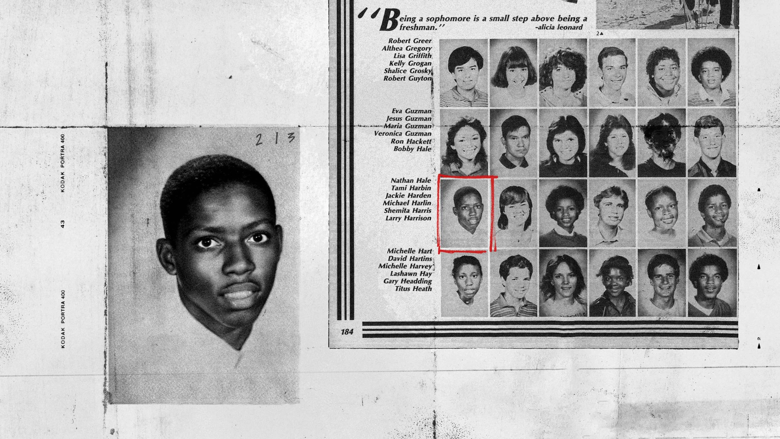
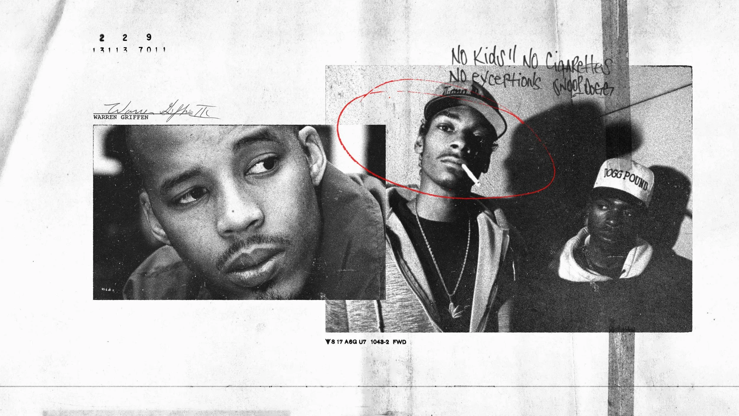
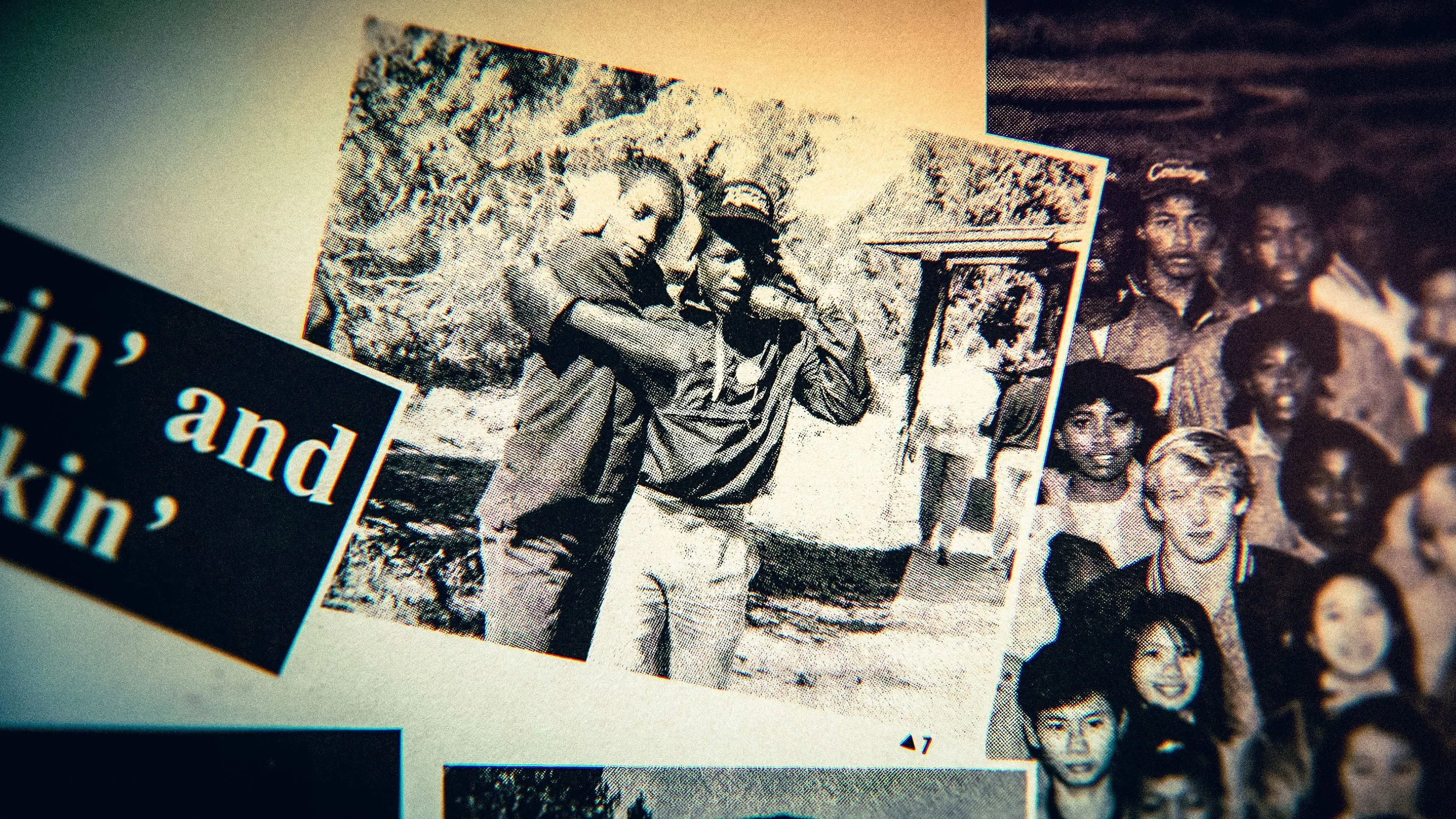
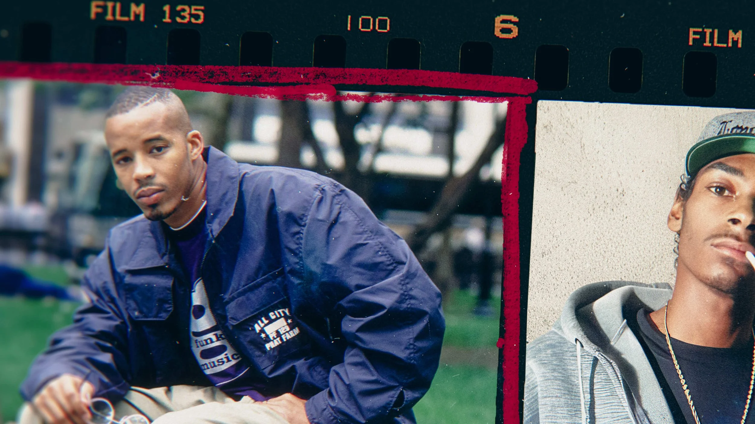
Xerox Scrapbook
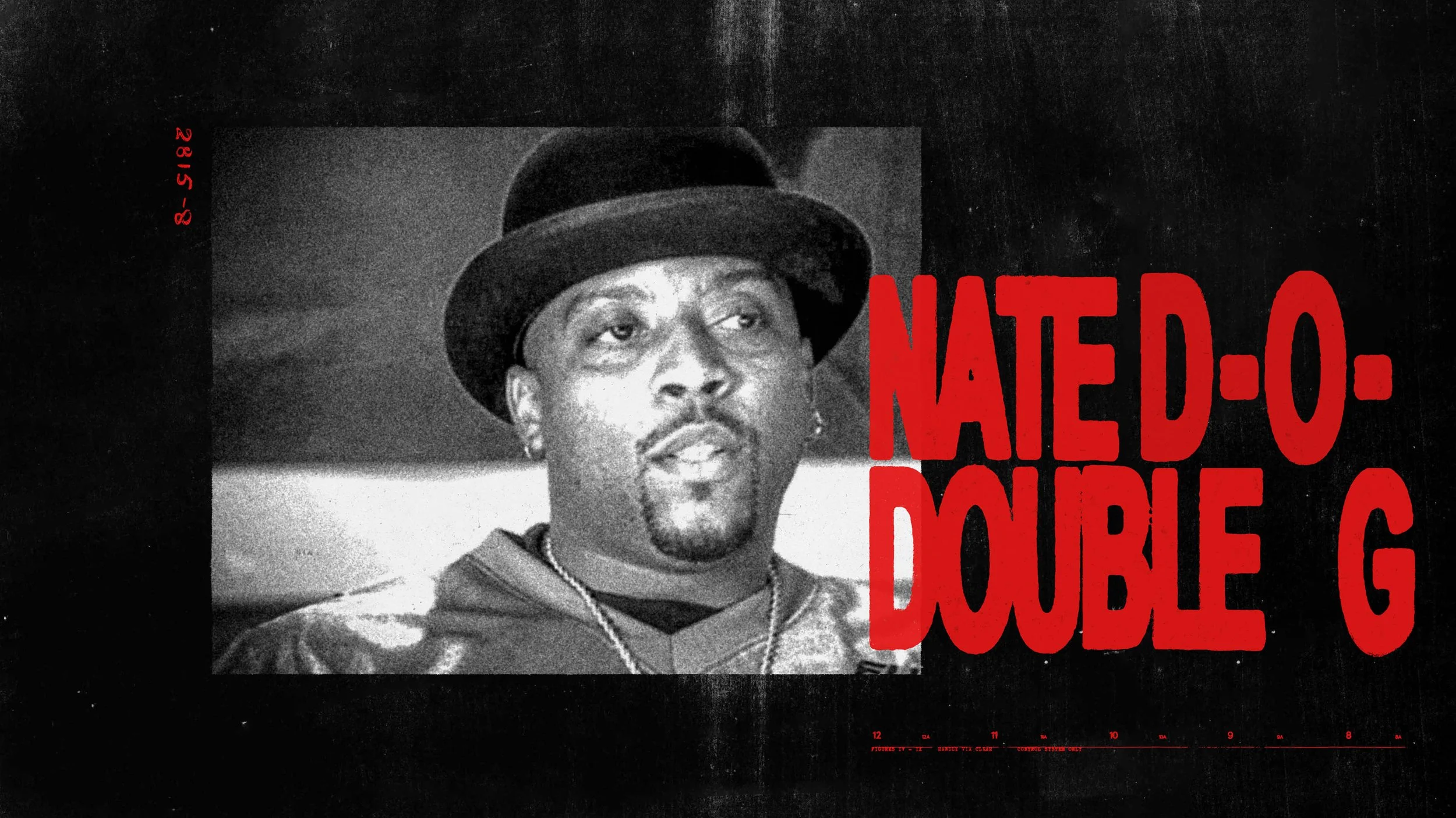
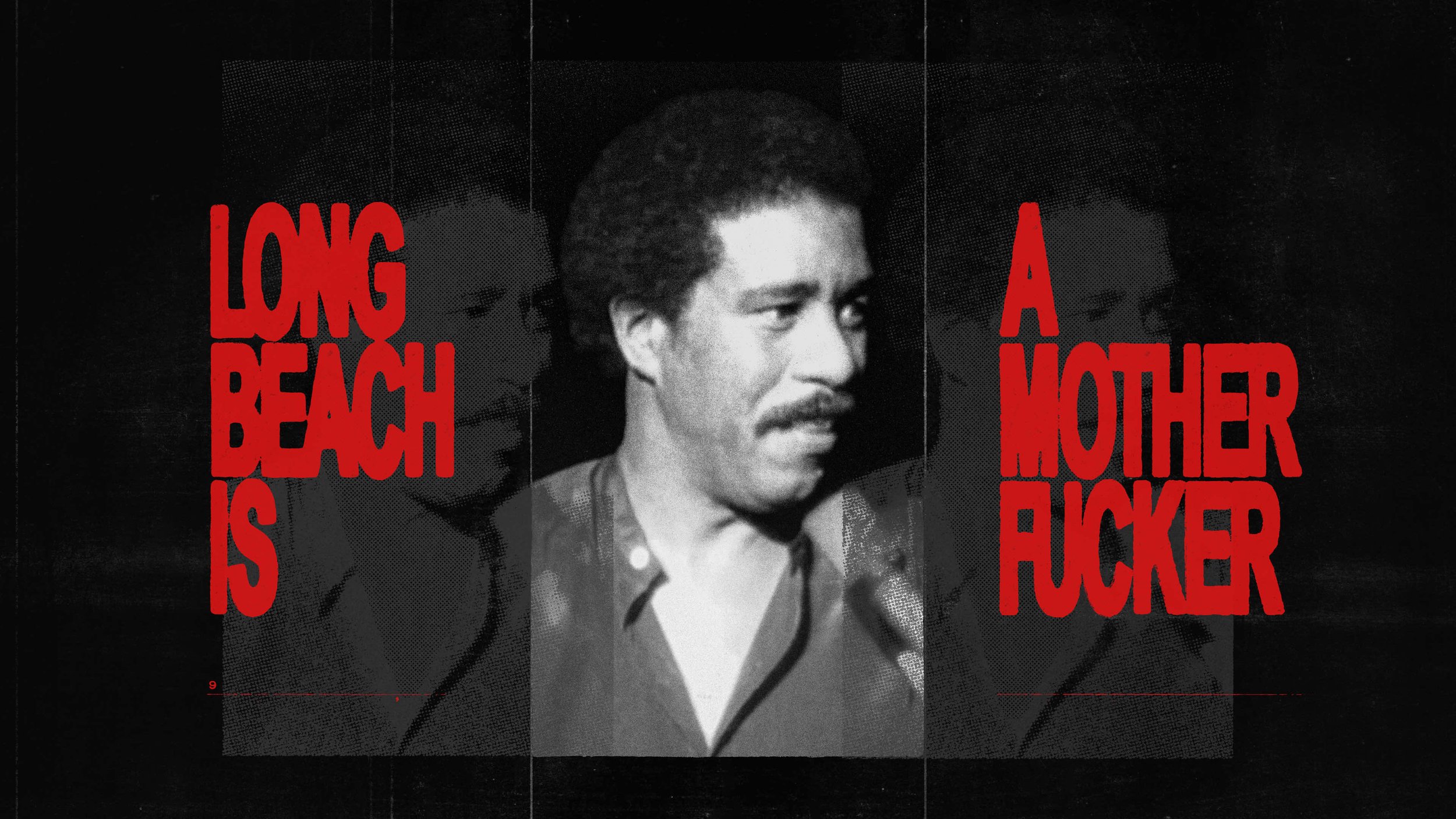
This direction is a visceral throwback to the era of the DIY music flyer, back when layouts were hacked together at the copy shop with scissors, tape, and a flickering Xerox machine. I leaned into a “low-toner” aesthetic, creating a raw, high-contrast visual language where the imagery feels almost scorched by the copier. The typography is a sharp, hyper-condensed red, cutting through the grain. To ground the chaos, I placed the iconic album jewel cases over blank, textured Xerox pages, while the footage is treated with a gritty, black-and-white halftone effect that favors stacked, rhythmic repetitions.

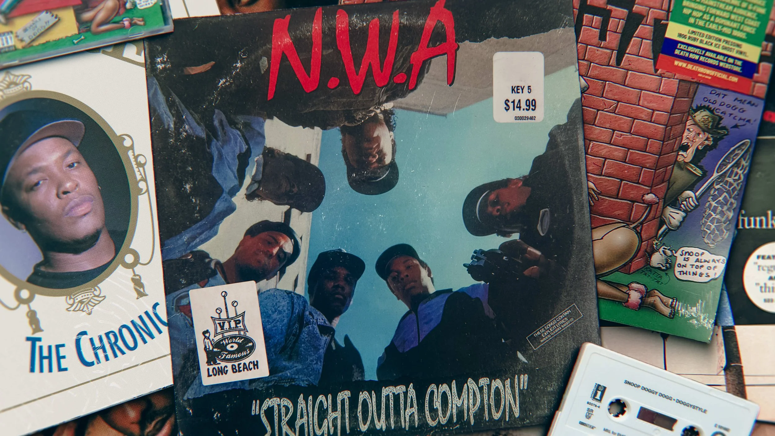
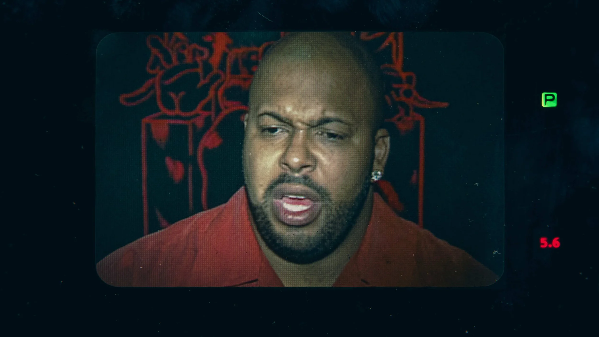
Darkroom
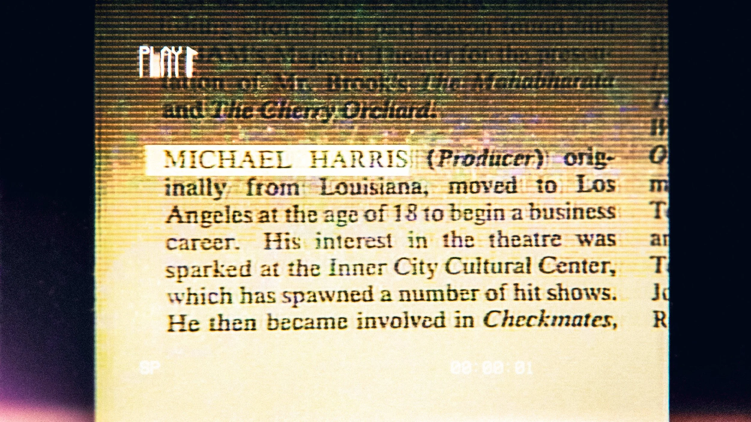
Finally, I explored a more minimalist direction where imagery is framed within rounded apertures of vintage film cameras. The contact sheets return, but this time they are marked with tactile wax pencil strokes to “select” the best frames. To inject a sense of cinematic urgency, I integrated in-camera display settings as functional graphic elements. The camera pans over curated piles of vinyl, cassettes, stickers, and compact discs, a physical mountain of media. To ground the entire experience, I added subtle textures like fingerprints and dust, making it feel as if these artifacts are being handled and arranged in real-time.