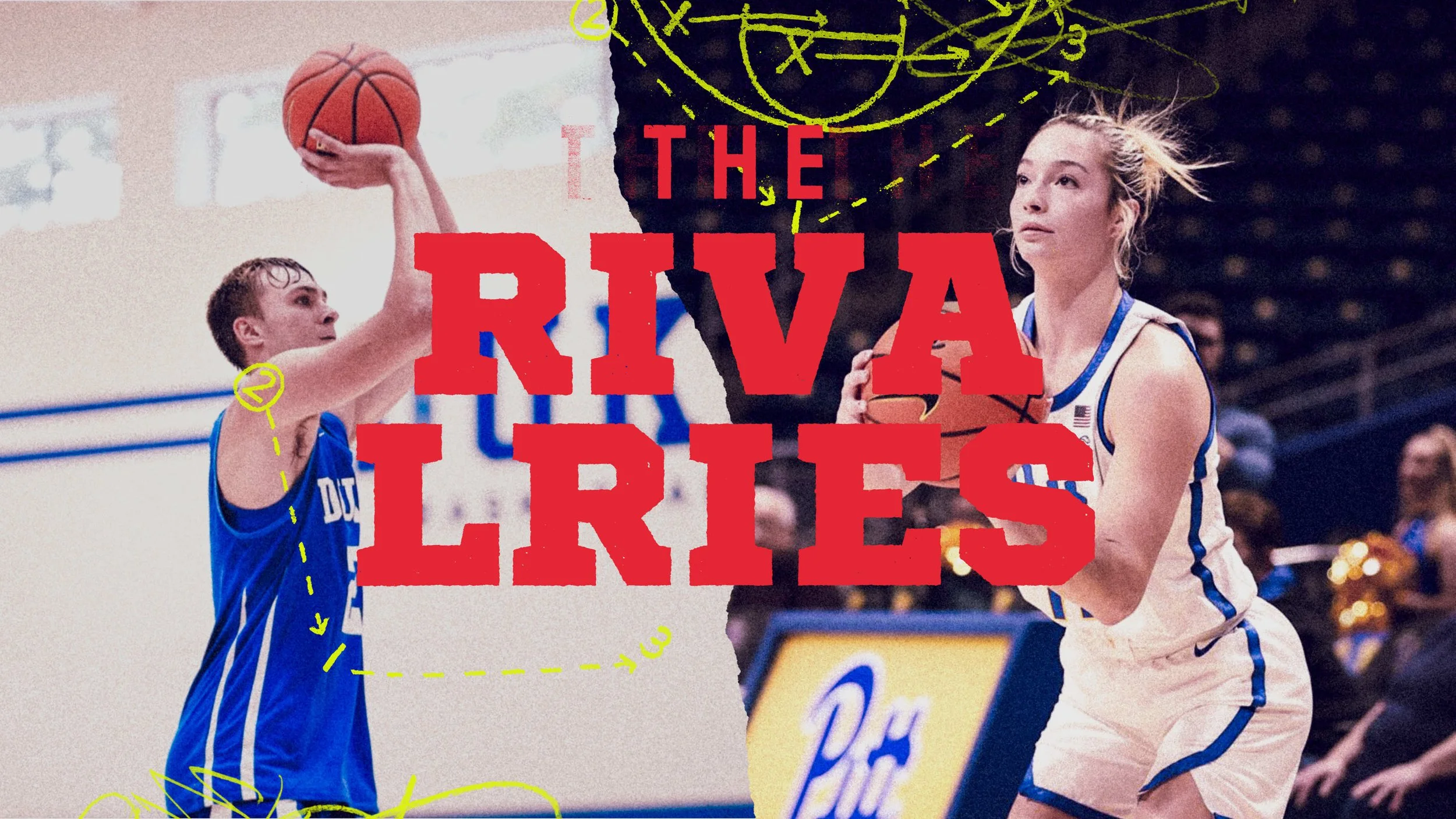
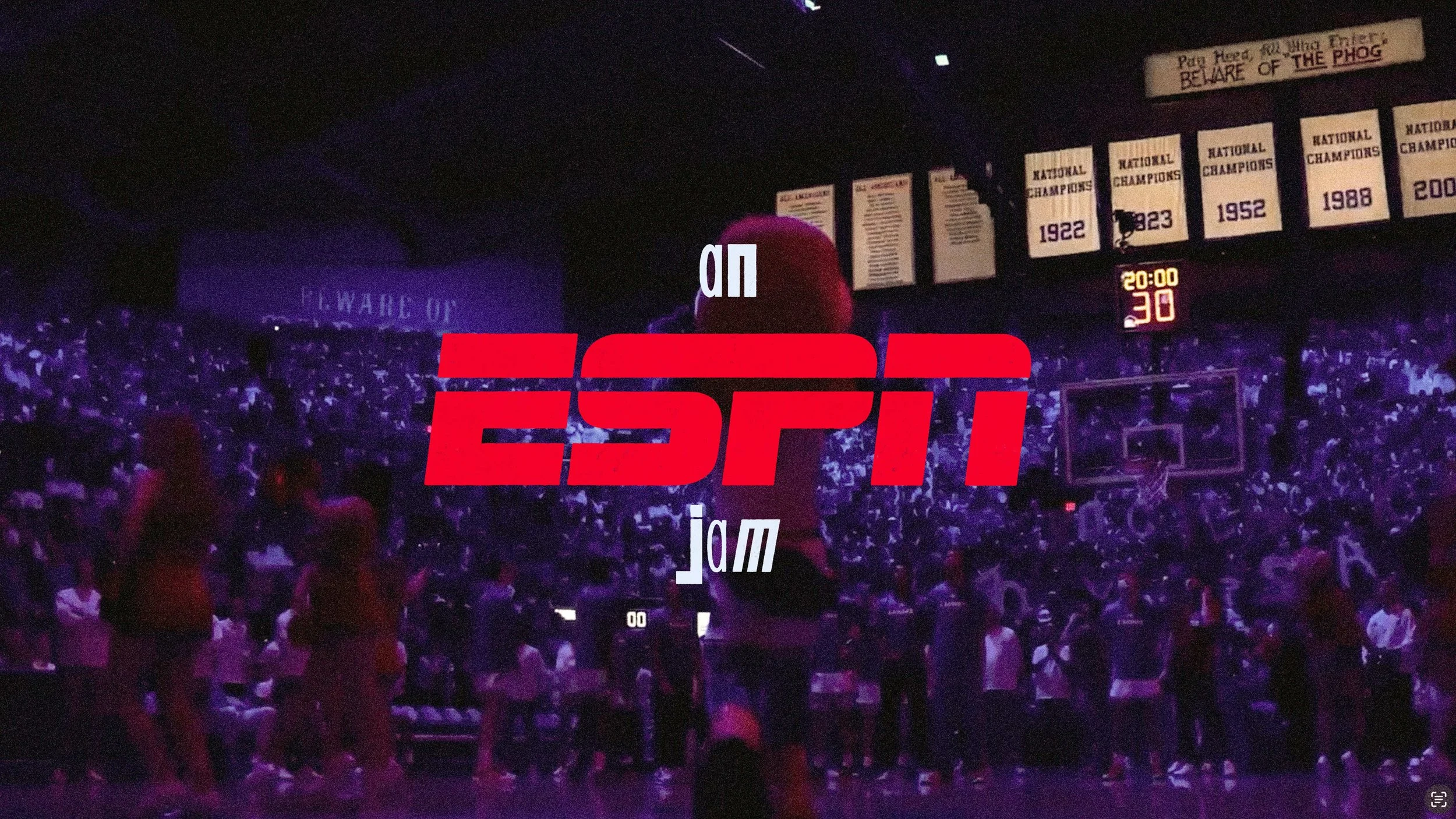
ESPN College Basketball
2025
Two Fresh
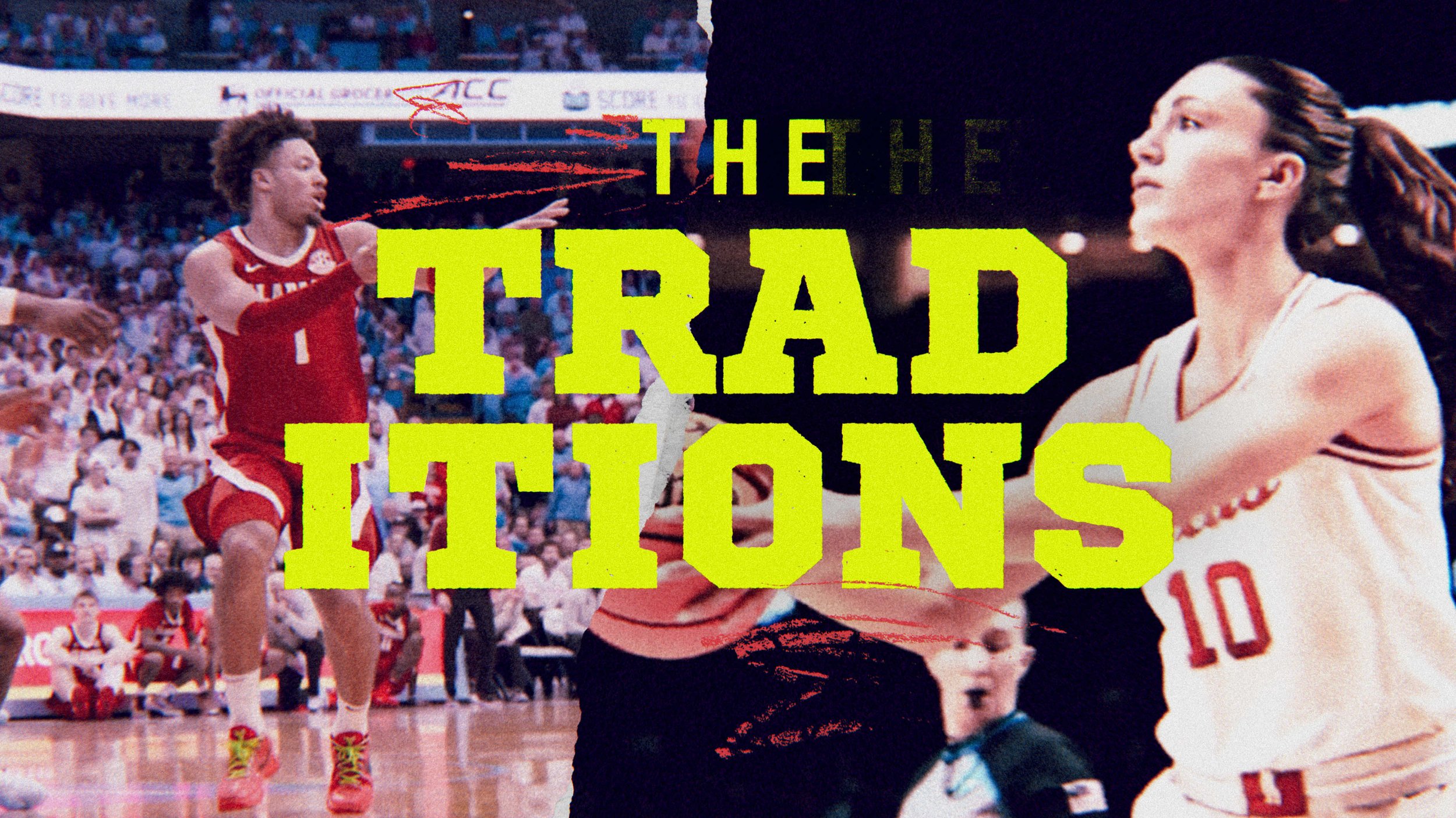
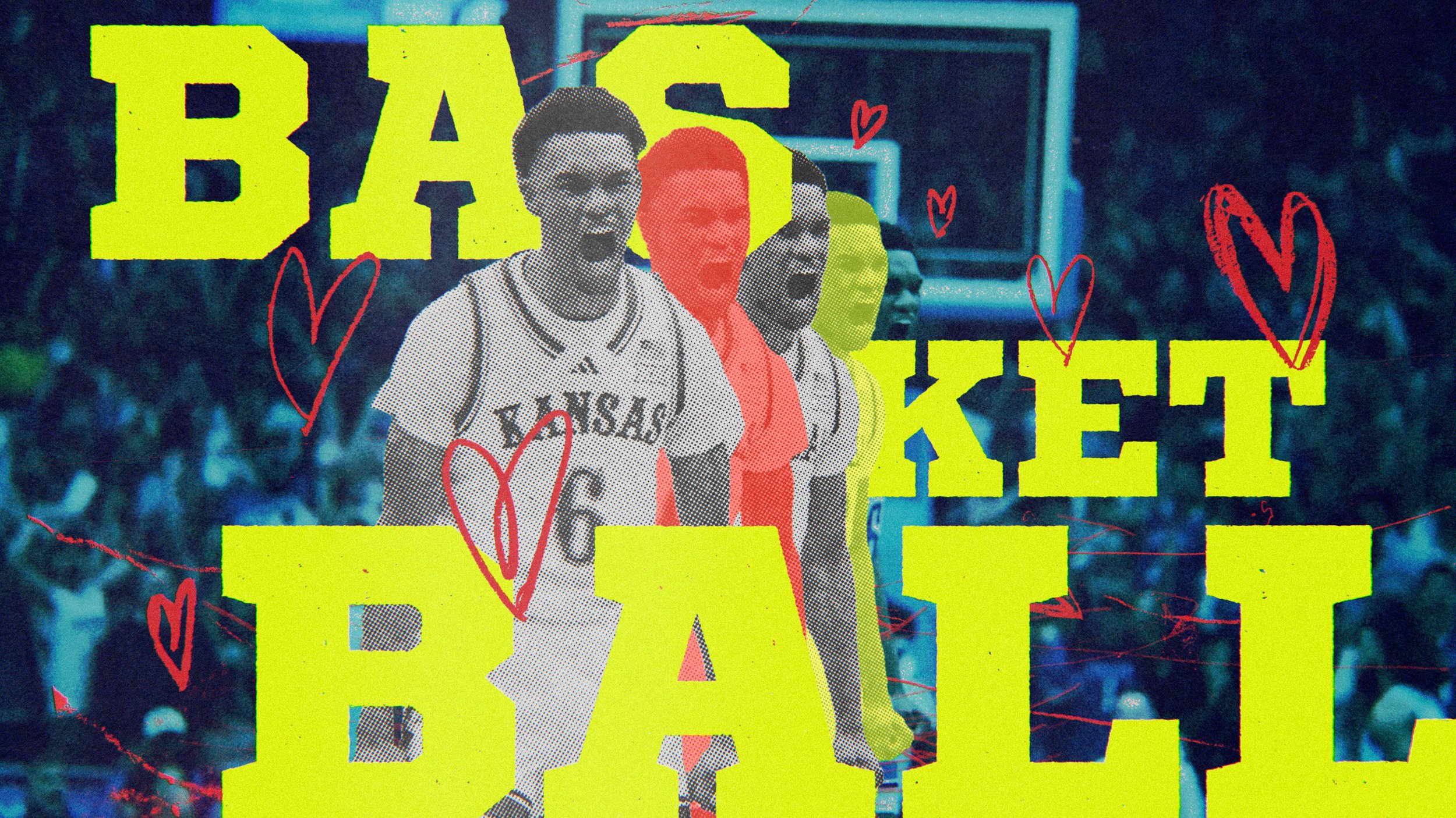
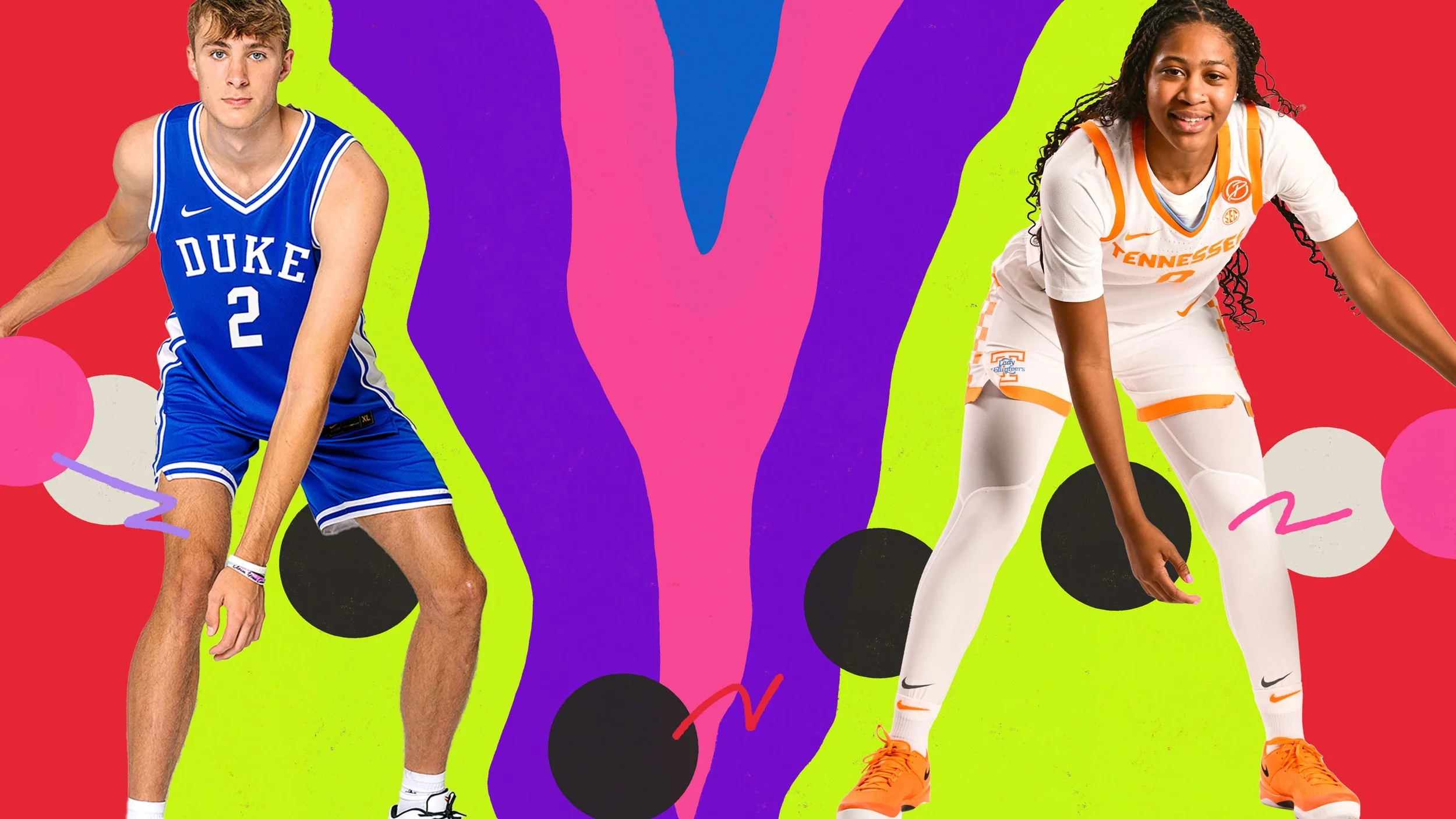
I teamed up with Two Fresh for a project centered on one of my favorite times of year: college basketball season. The promo was fueled by the classic Lil Bow Wow track “Basketball” (major Like Mike nostalgia), blending editorial footage from last season with high-energy graphics. Since I was at the helm of creating style frames, I had to sneak my UH Cougars in there.
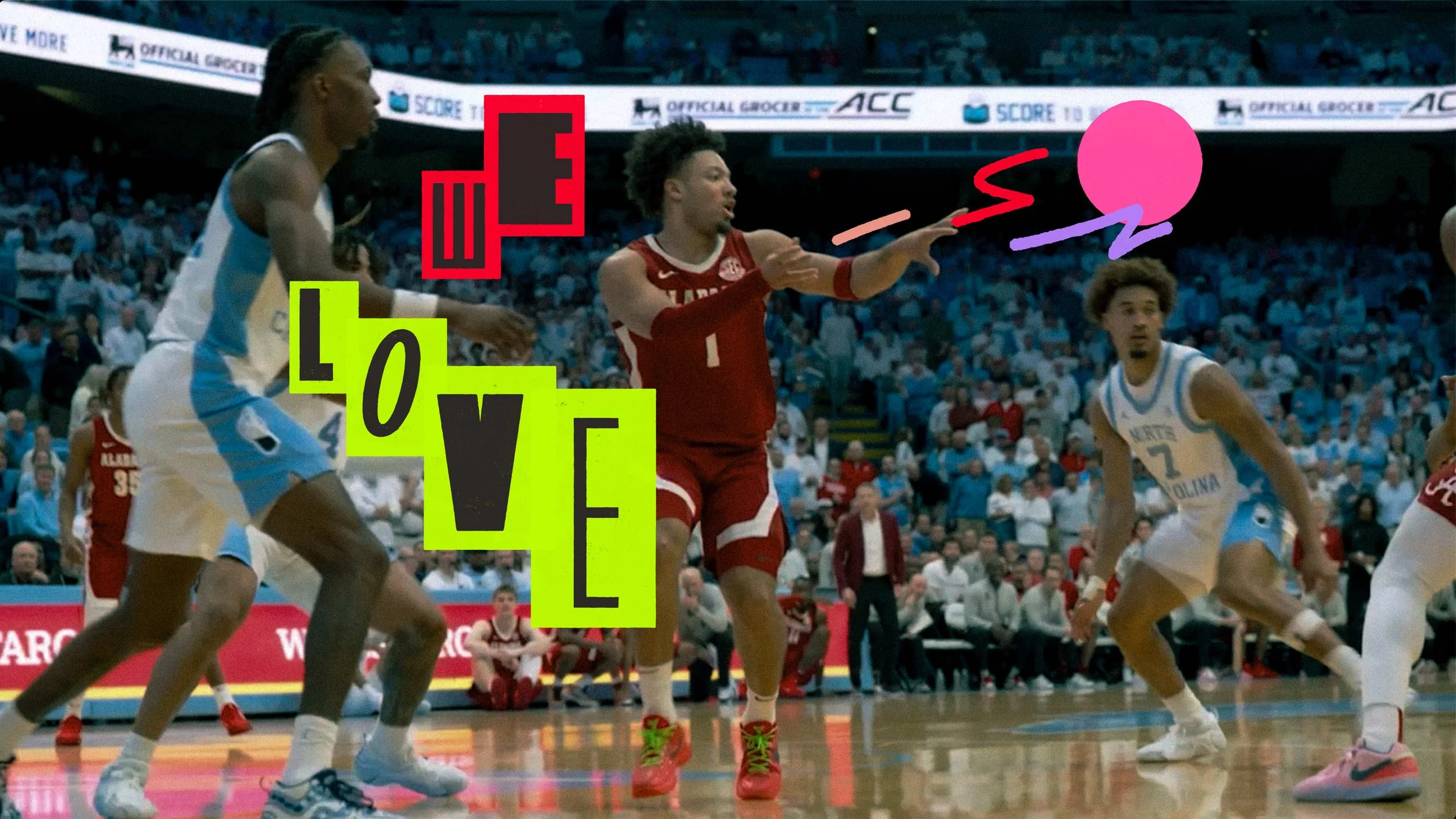
After pitching three distinct creative directions, we landed on a winner and dove into the details—exploring custom type treatments and motion graphics that layered over the footage to create seamless, clever cuts between the men’s and women’s games.
This project had some serious legs, airing on ESPN during peak NFL and college football slots. While the final broadcast version took a different design path than the one I created, I loved the challenge of designing for such a high-profile stage. The original frames are still some of my favorites, even if the "as-aired" version went in a new direction.
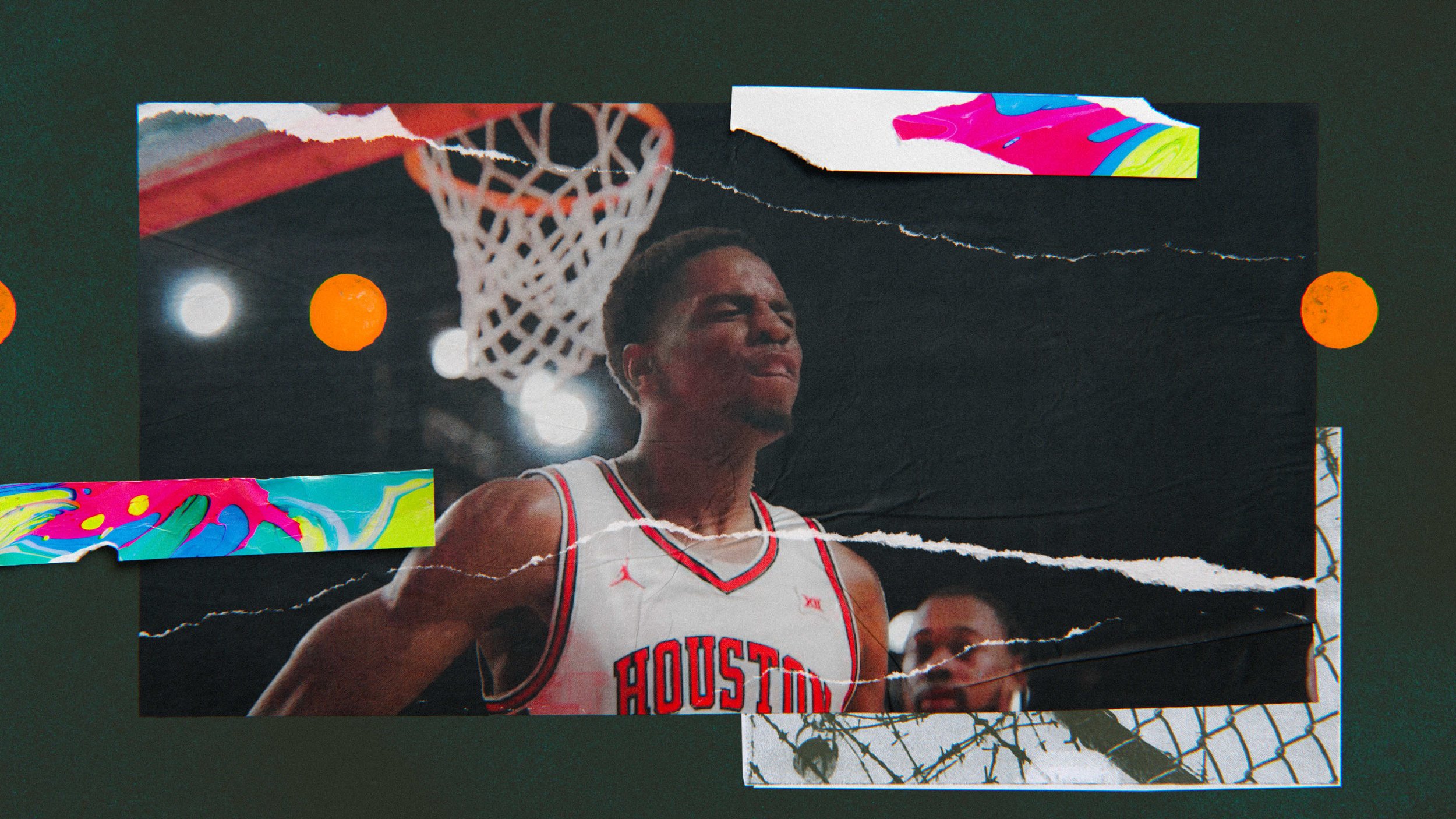
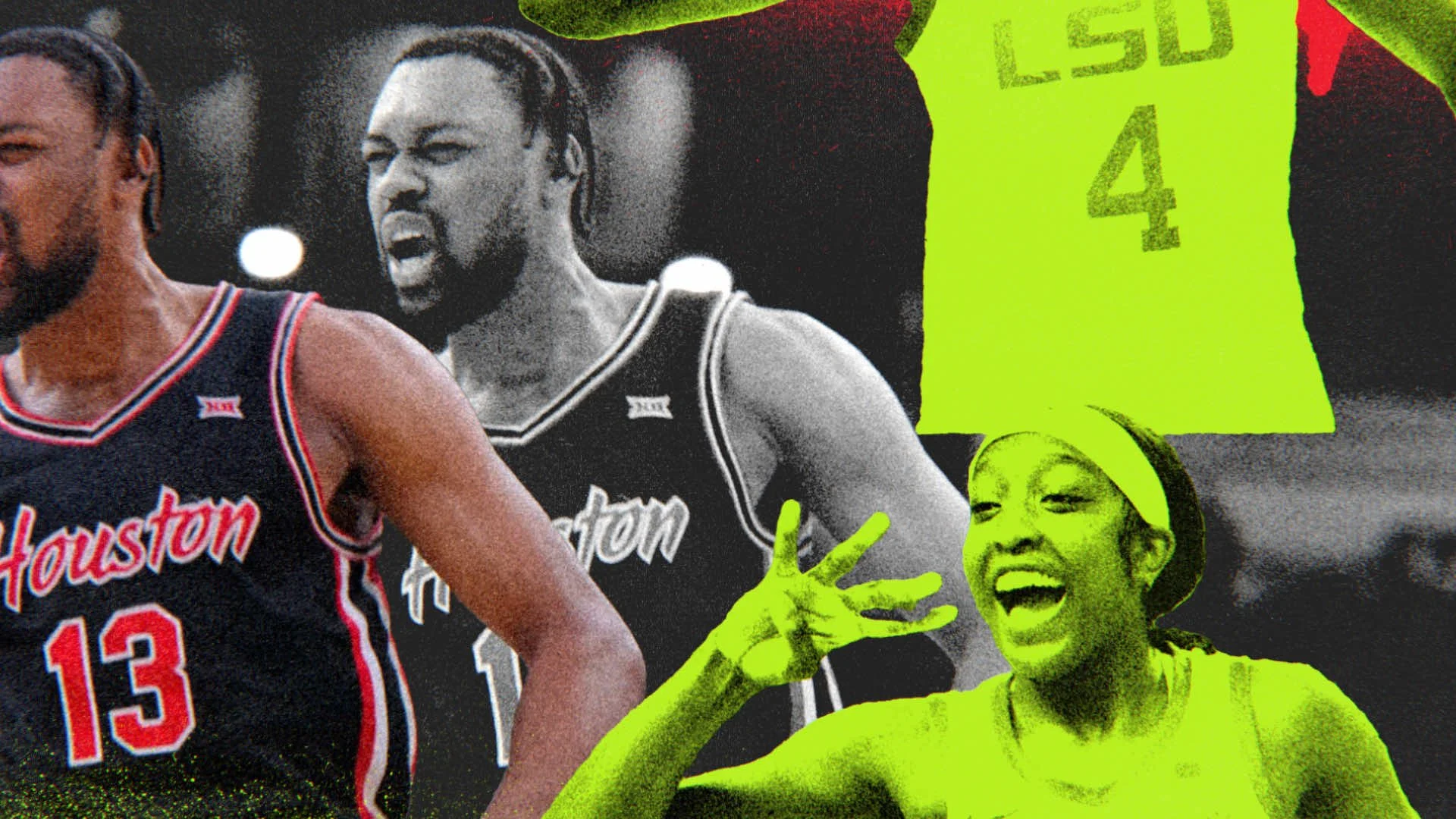
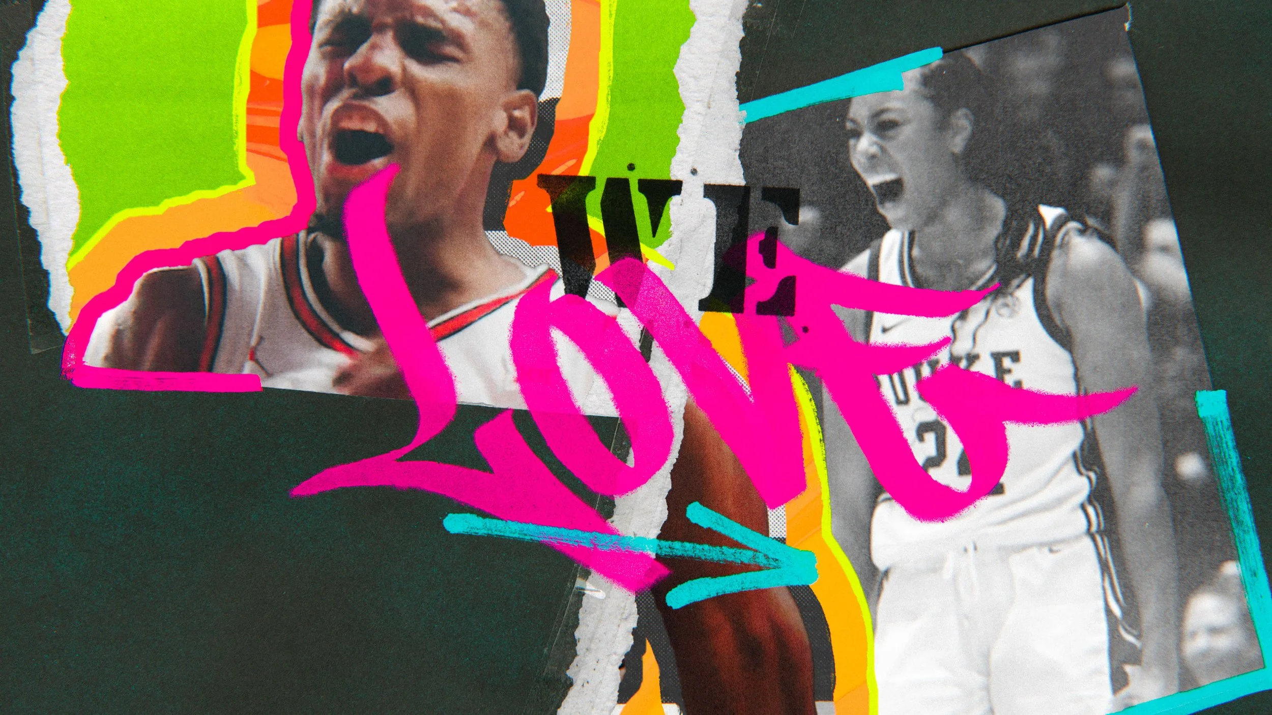
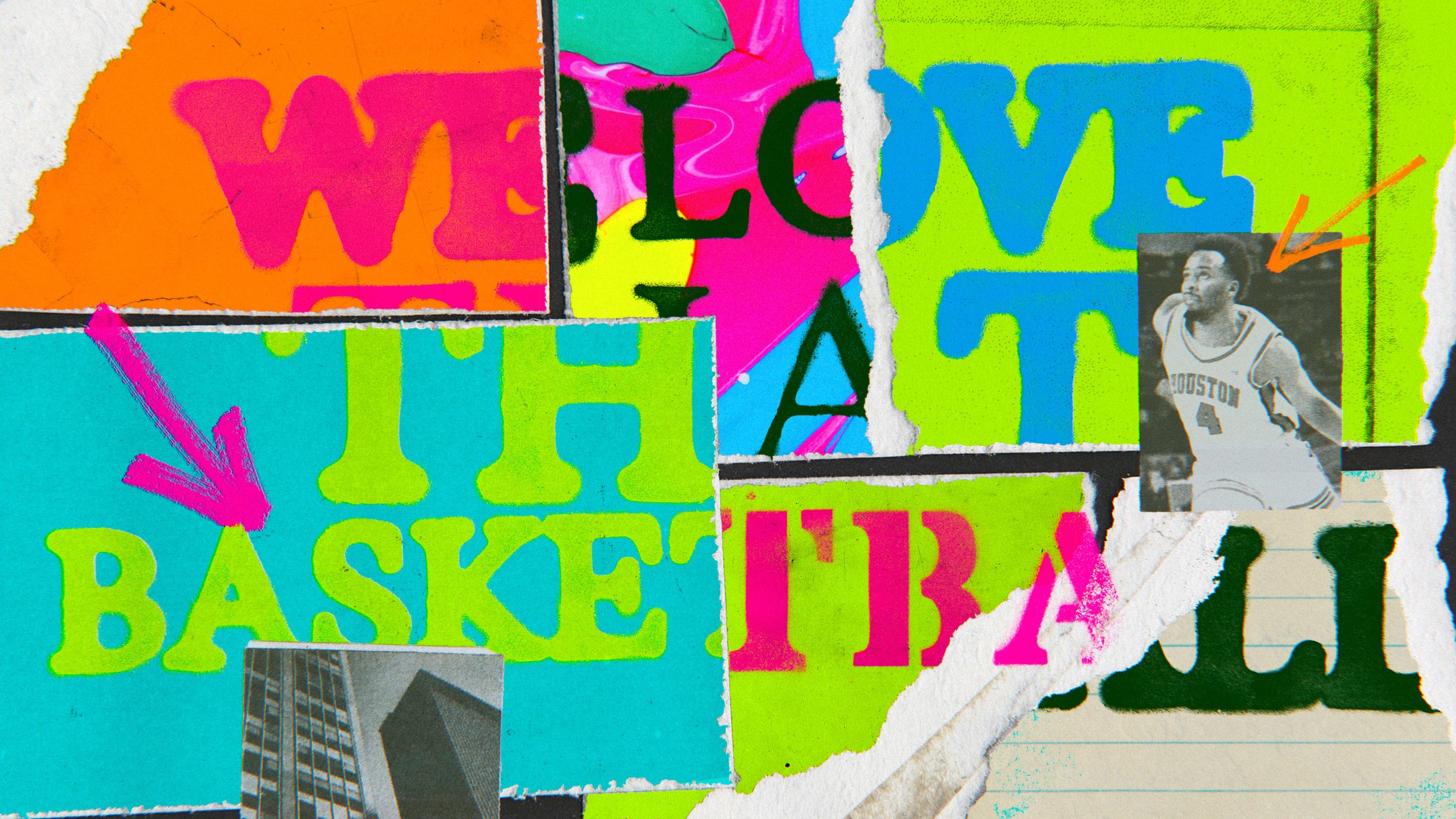
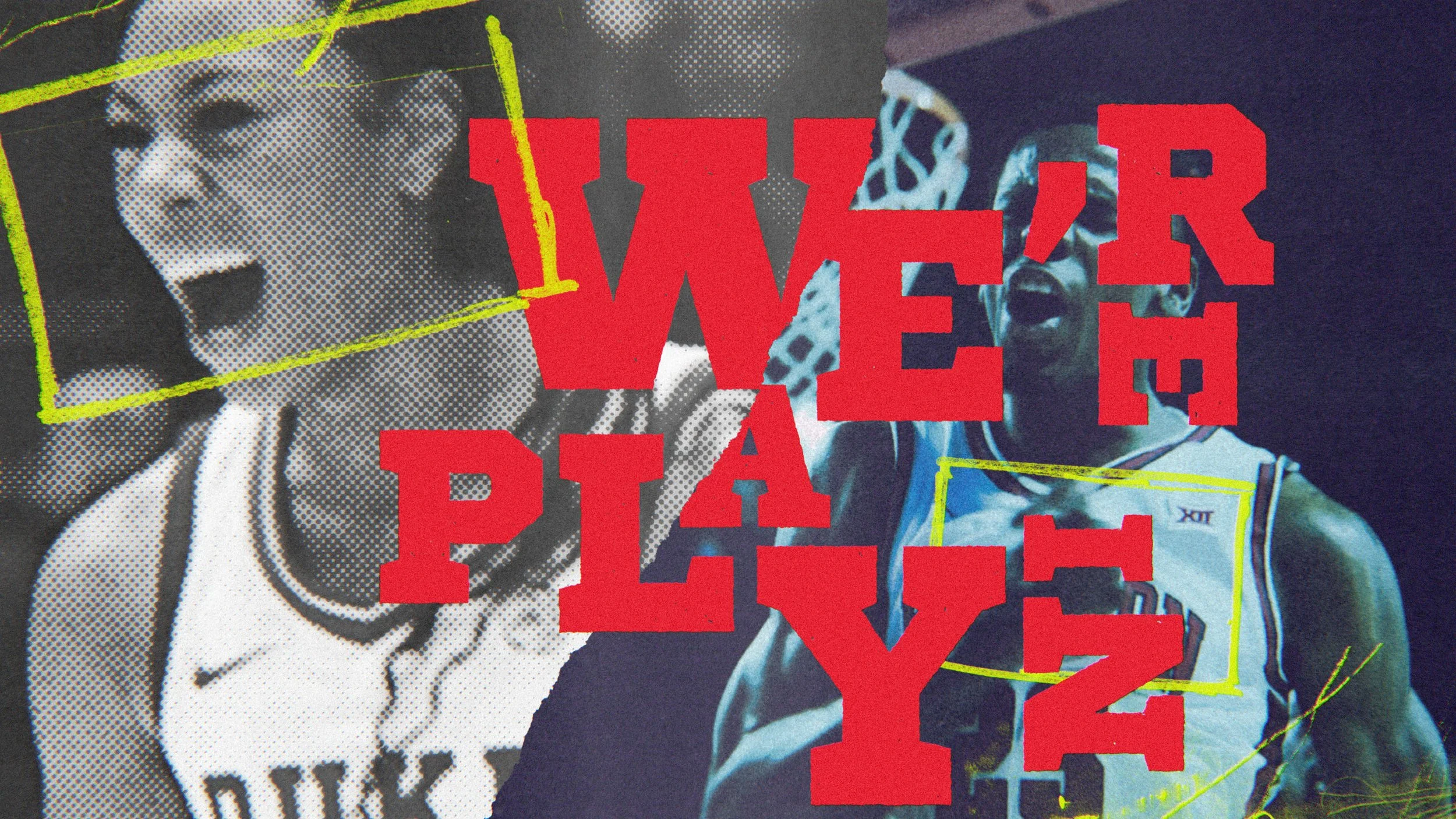
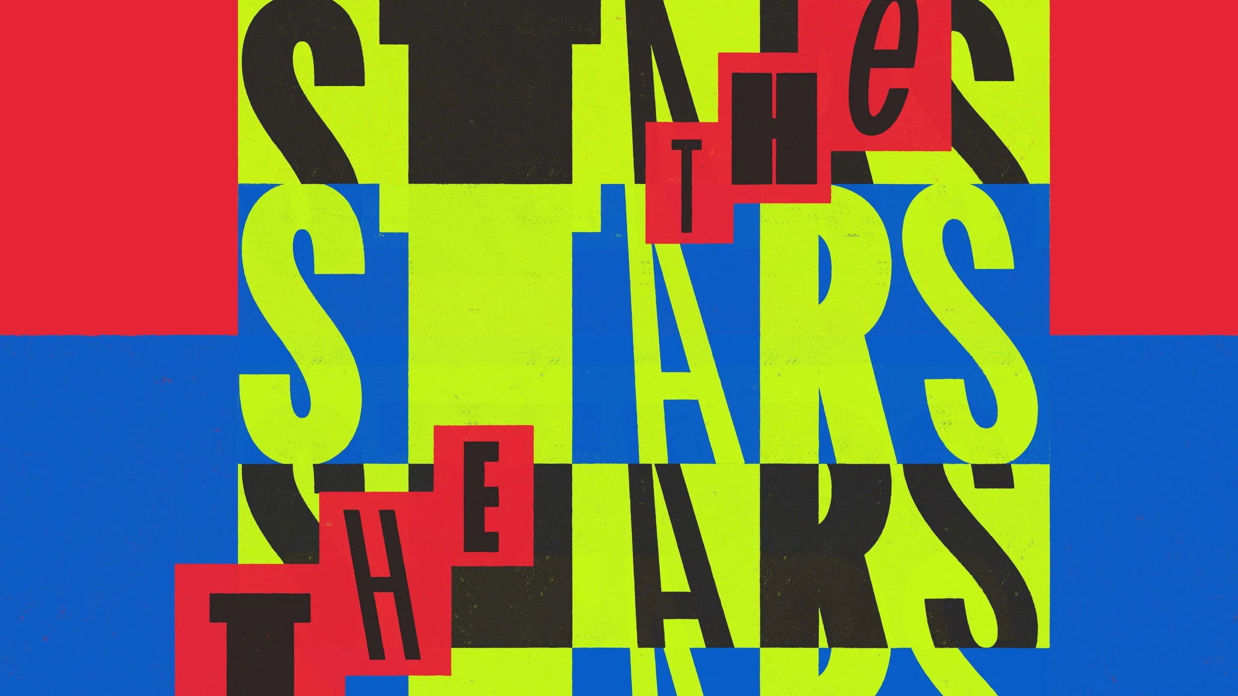
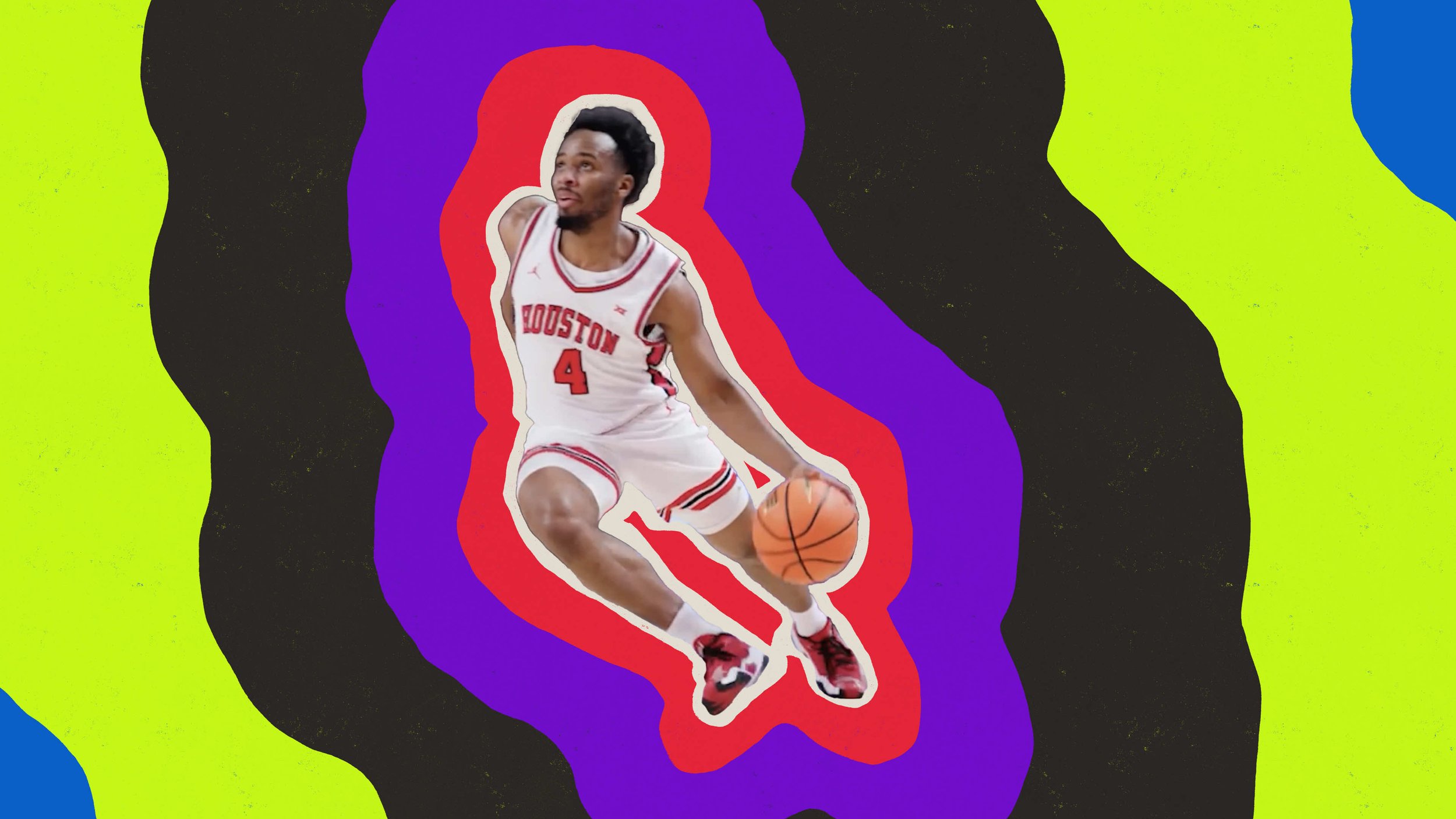
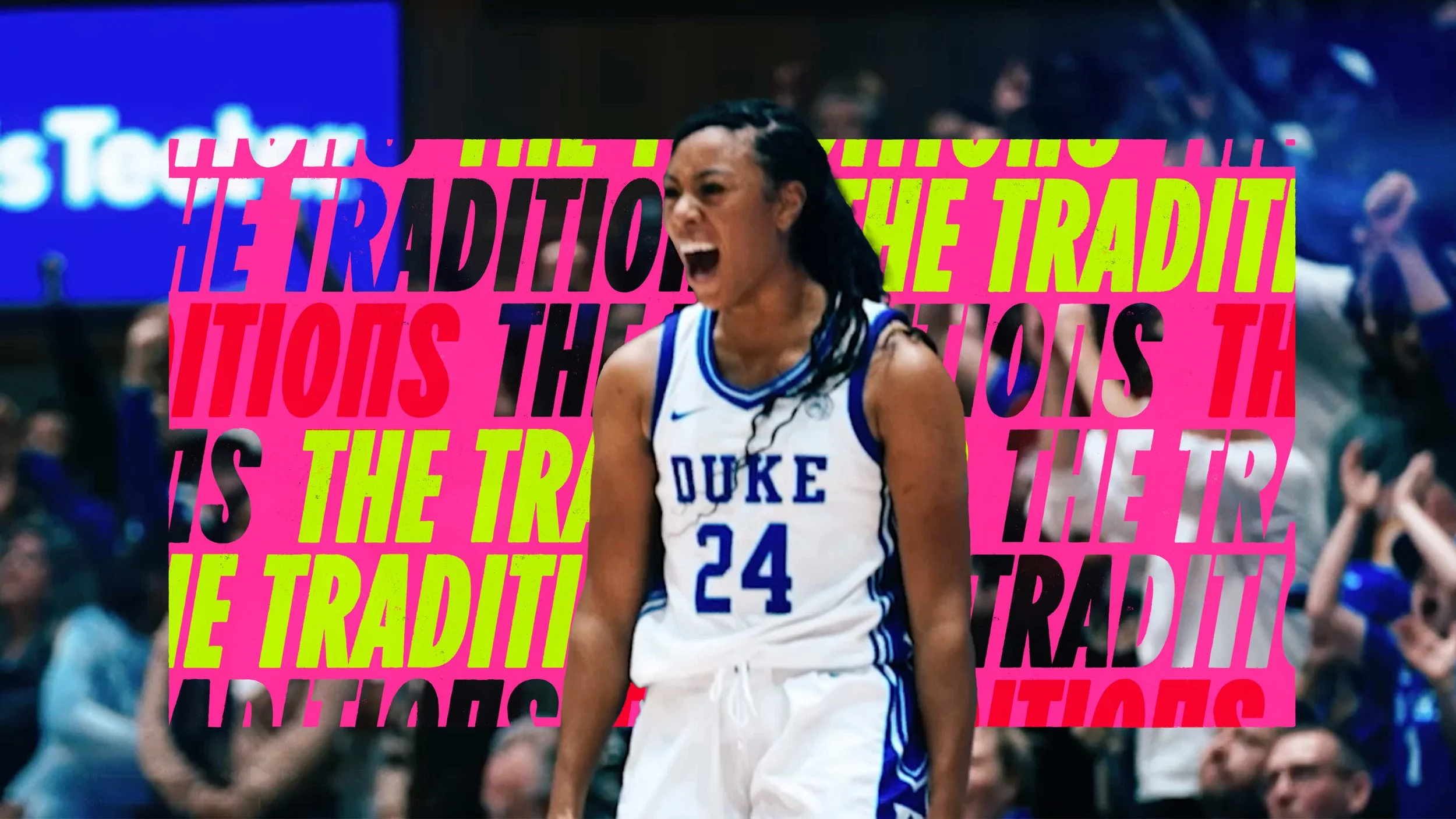
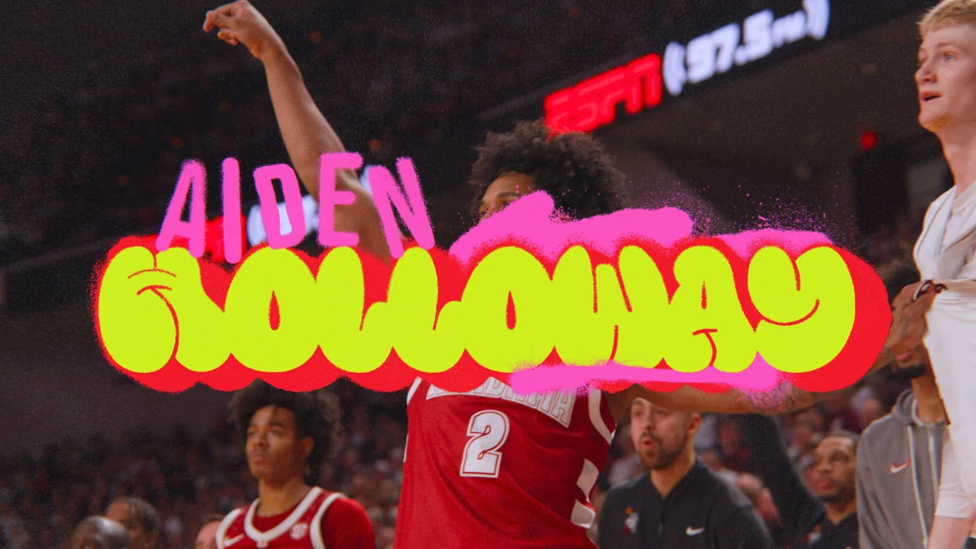
Wildstyle Hardwood
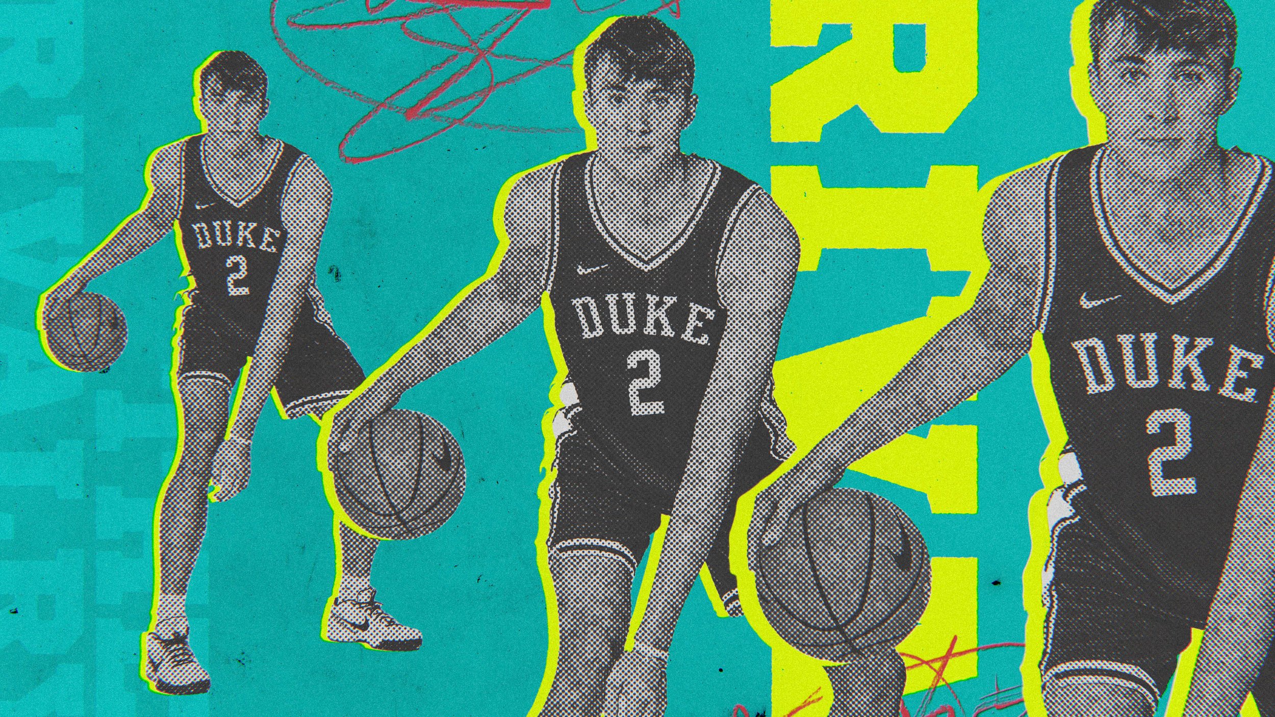
In this direction, I went for a raw, unapologetic vibe here mixing vibrant, hand-style typography with layers of collage and heavy repetition. The result is a textured, street-inspired look that feels like it was pulled straight off a city wall. It’s got that perfect urban “soul” that captures the rhythm and attitude of the song.
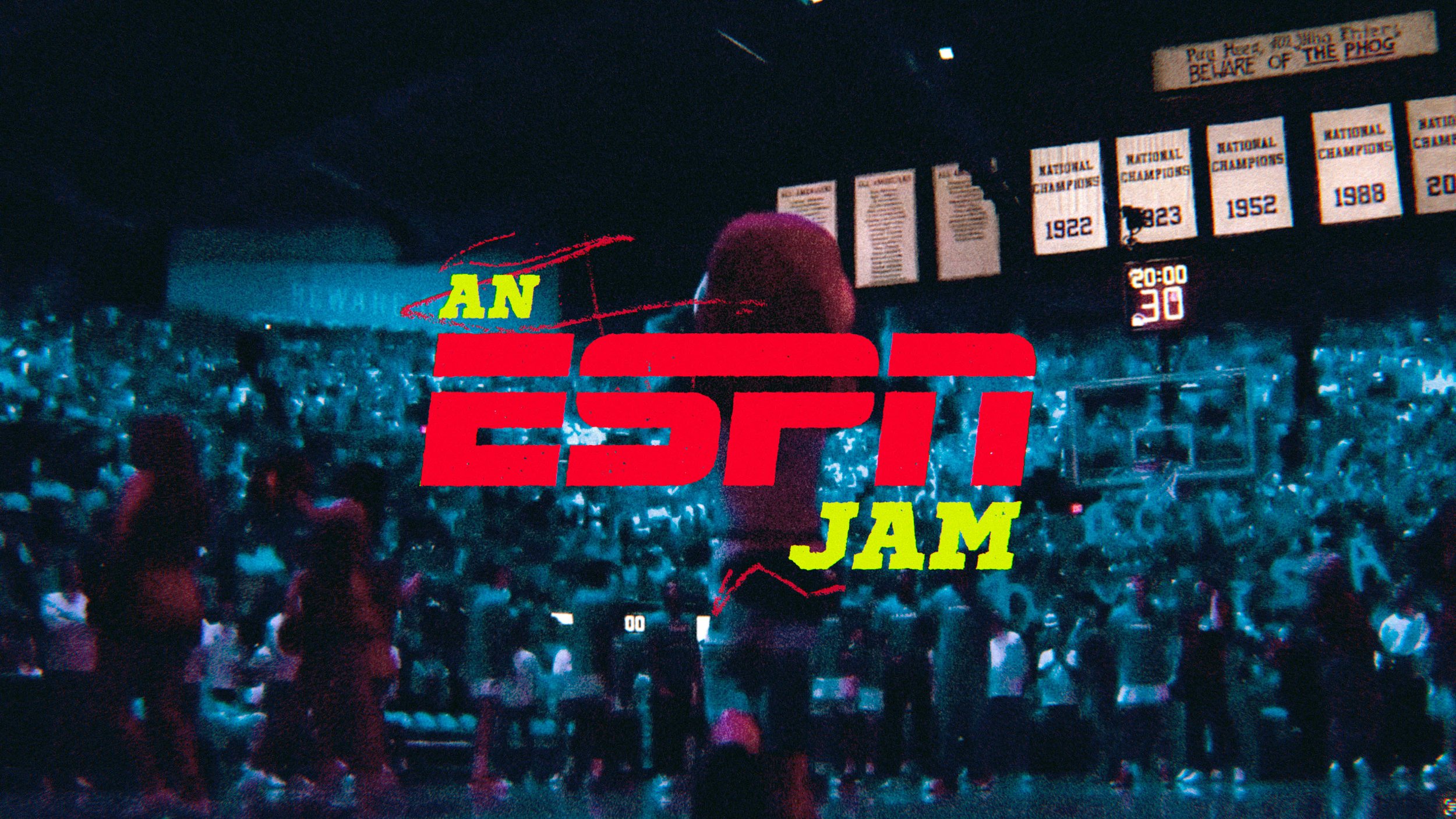
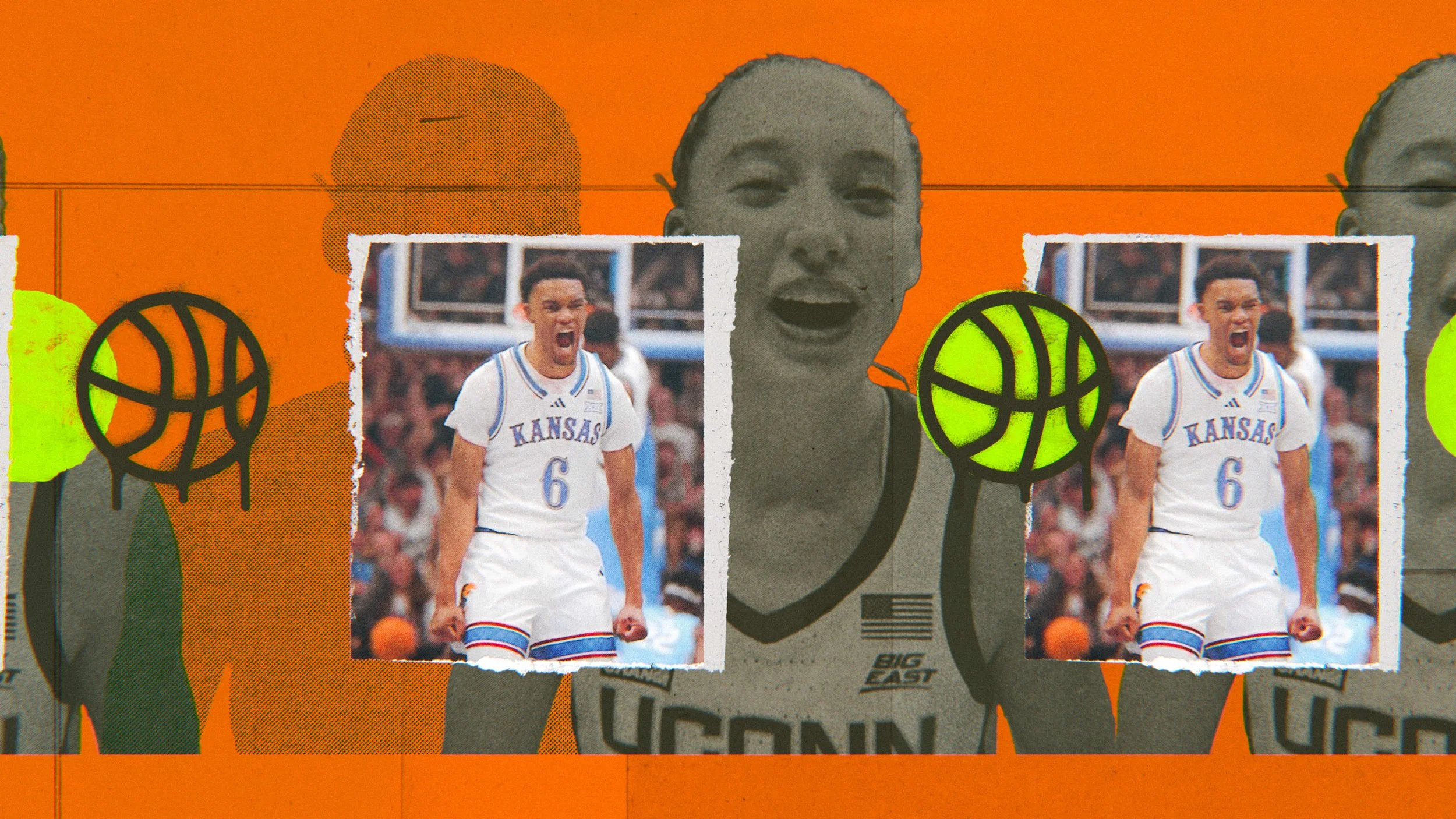
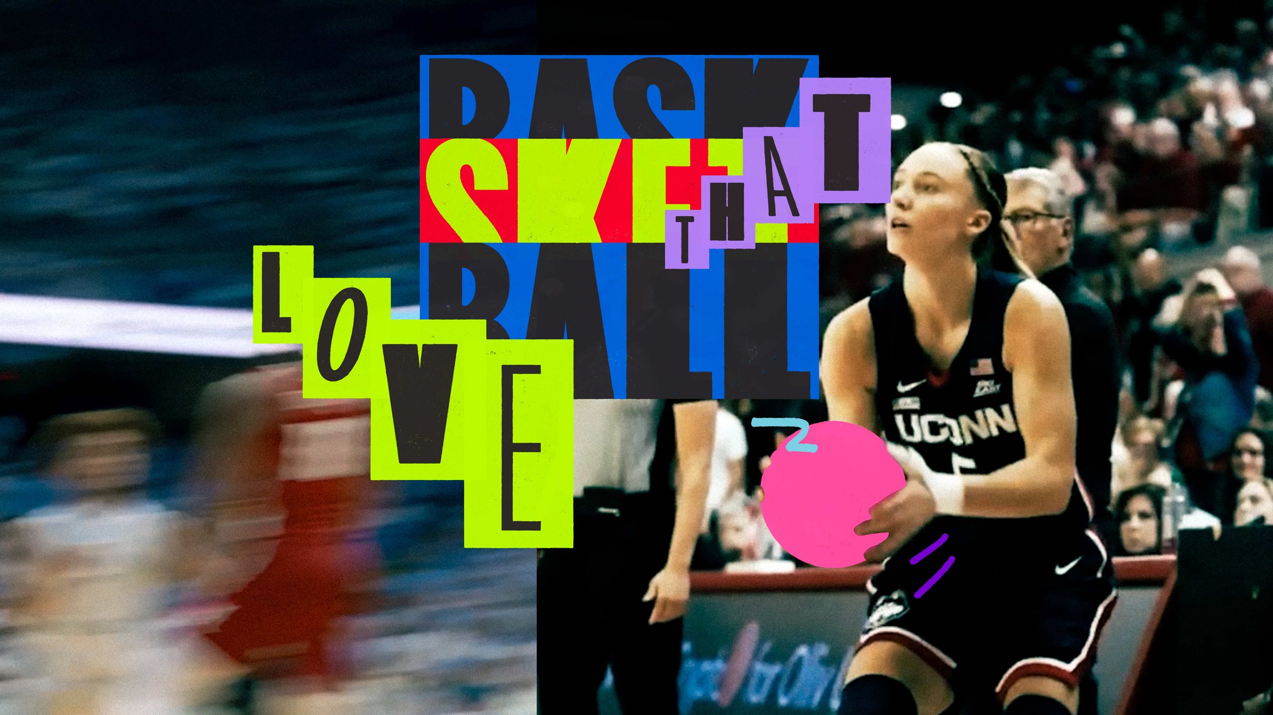
The Playbook
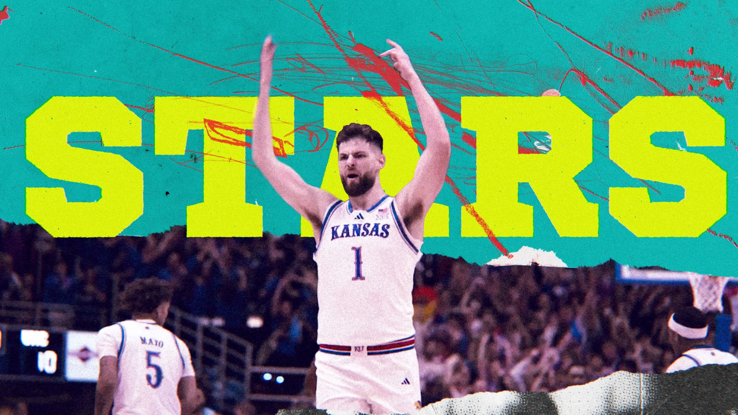
For this route, I wanted something that felt both traditional and totally raw. I paired a heavy-hitting slab serif giving it that undeniable “varsity” identity with a series of frantic pencil sketches that sporadically reveal tactical plays from the playbook. To keep the energy high, I used a torn-page aesthetic for the split screens and leaned into a “stutter-step” repetition, stacking and staggering frames to mimic the heart-pounding anticipation of tip-off.
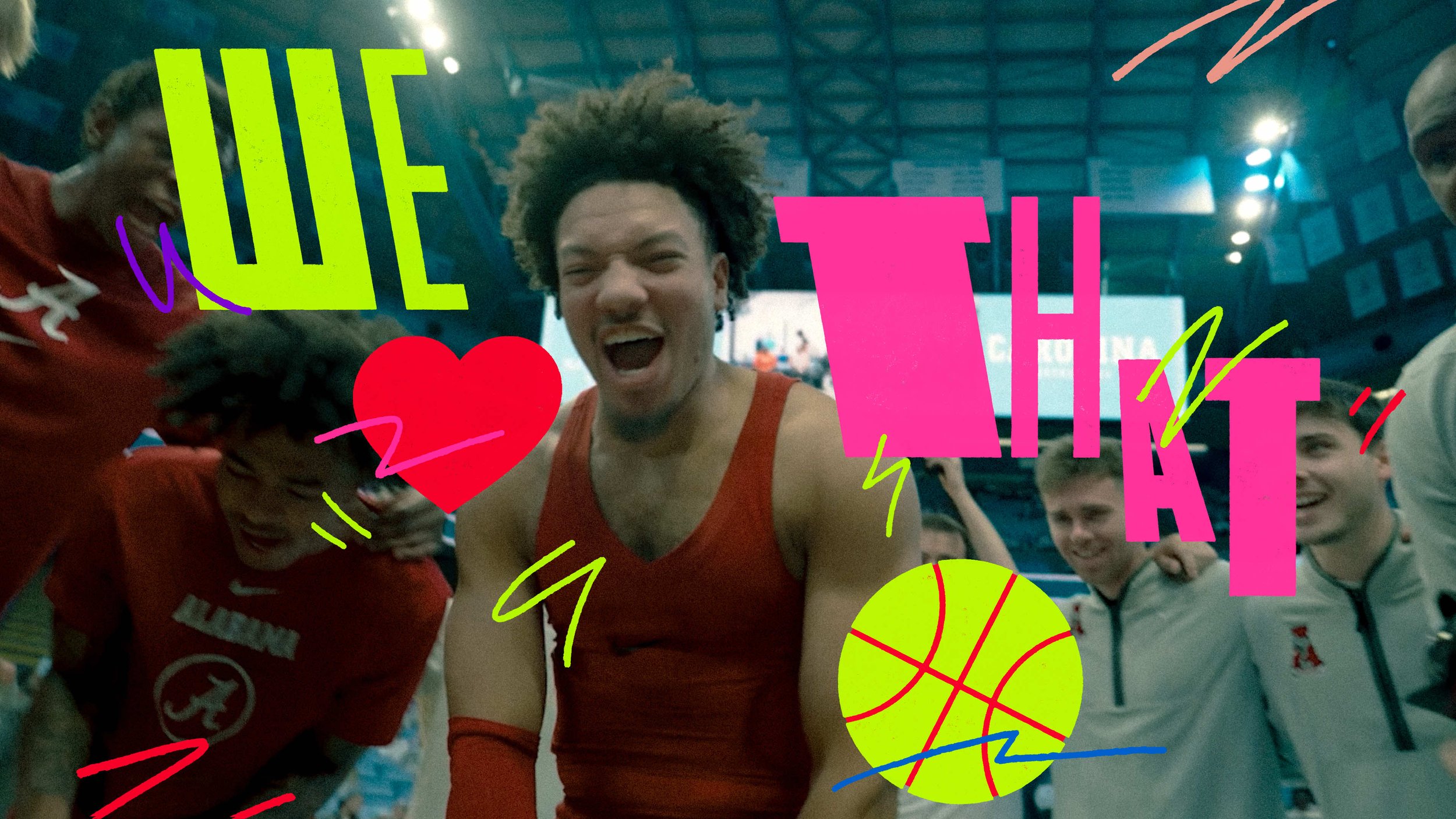
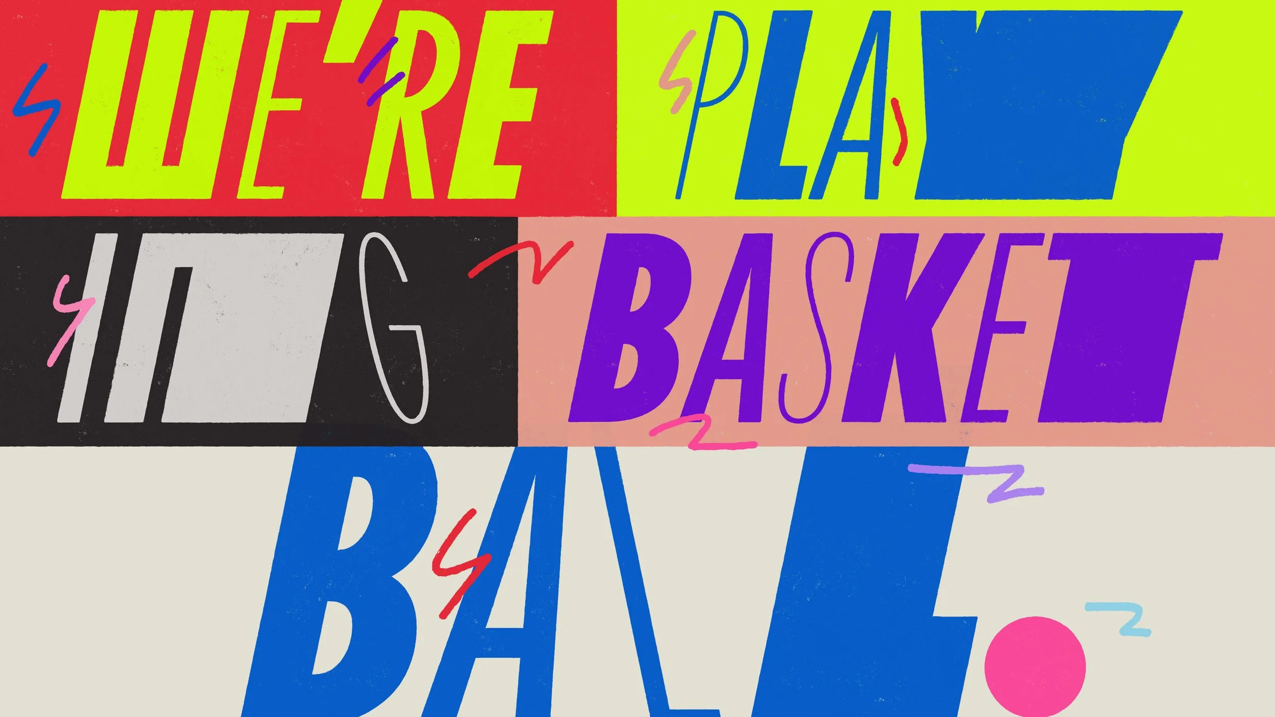
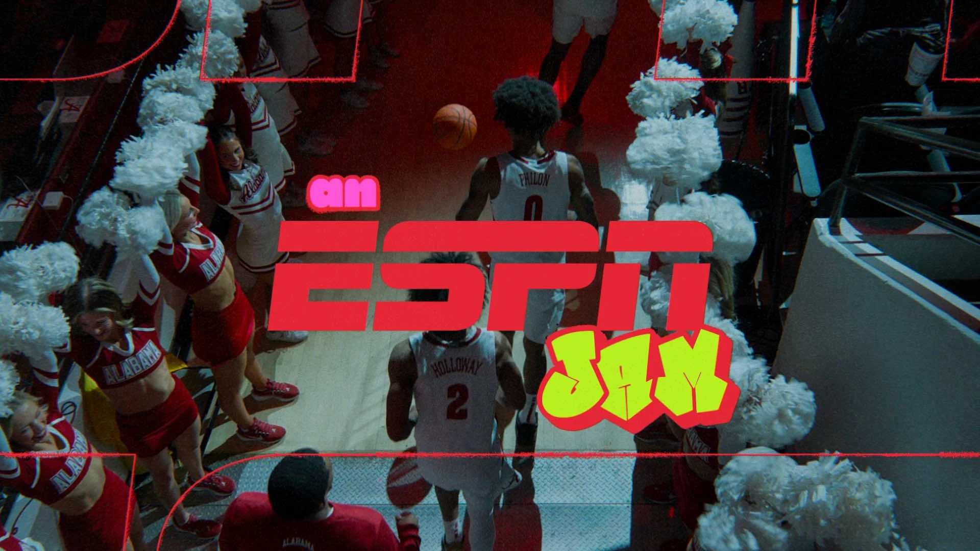
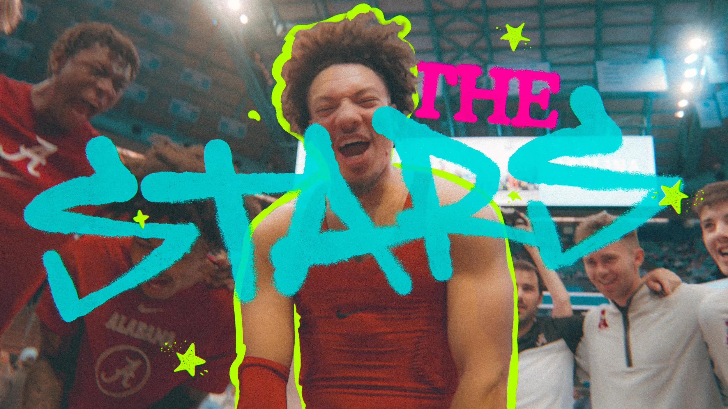
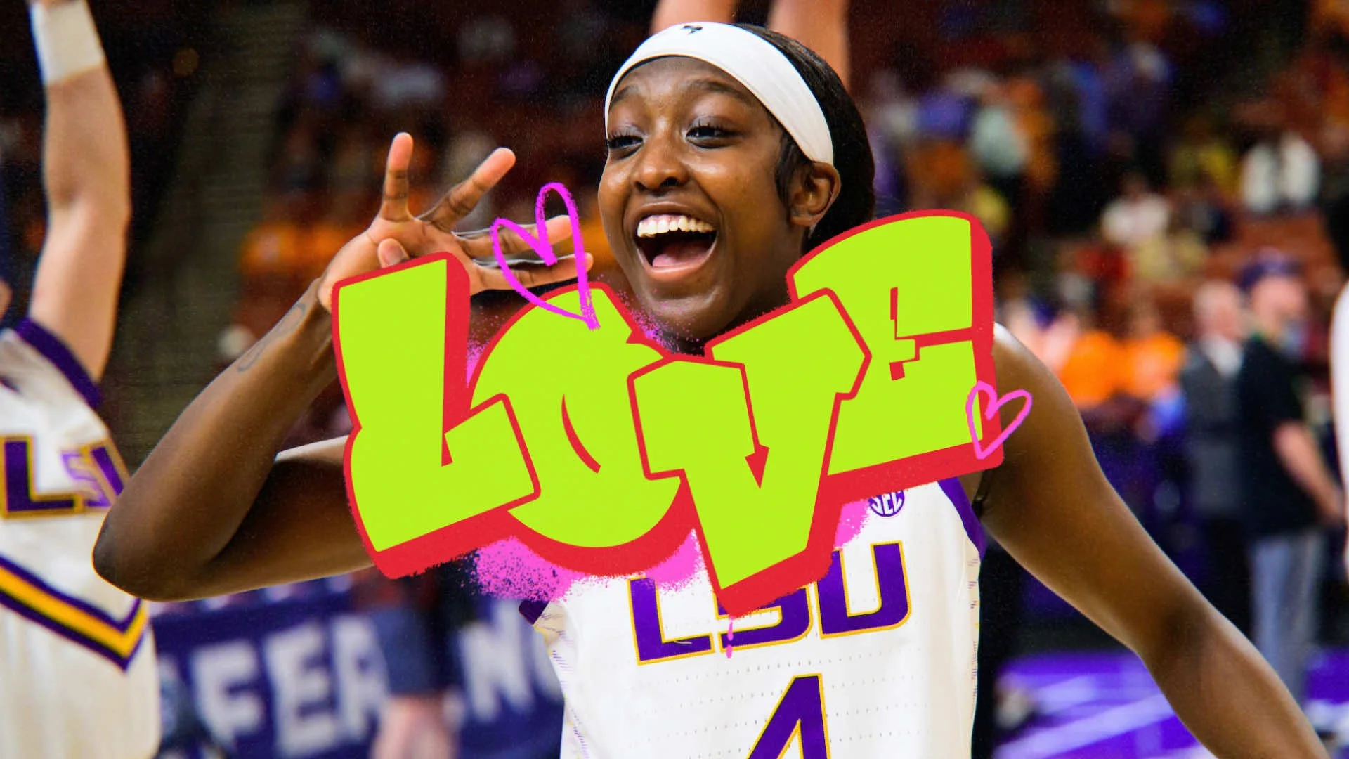
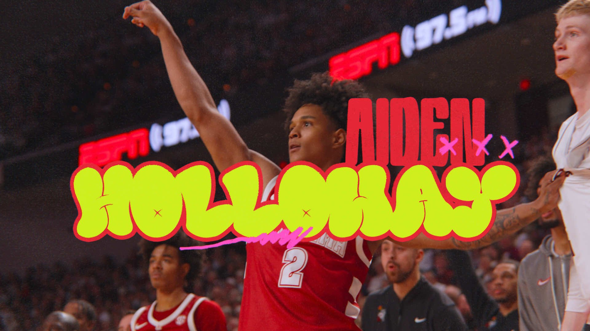
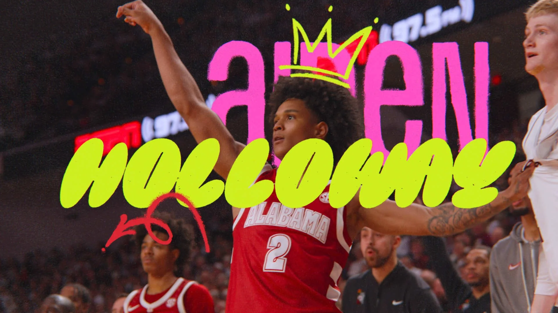
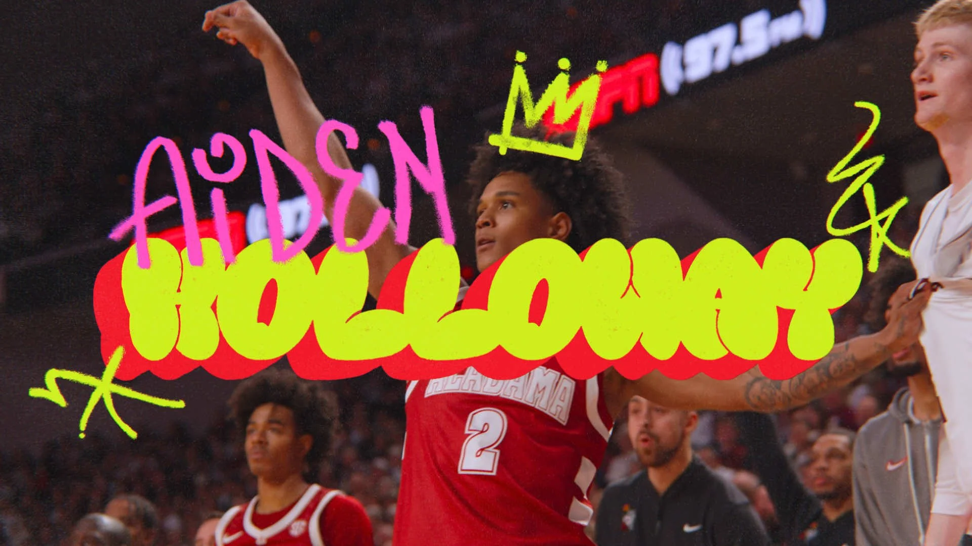
No Look Neon
I’m a firm believer in throwing an “out-there” wild card into the mix—a direction that zigs while everyone else is zagging. No Look Neon was essentially me designing for my own inner fan; it’s exactly what I’d want to see on my screen. This route features a sharp, contemporary type layout that plays with alternating weights and aggressive italics and extensions, all drenched in eye-bleeding neon. It’s a loud, high-contrast nod to the 90s that’s equal parts throwback and future-forward.
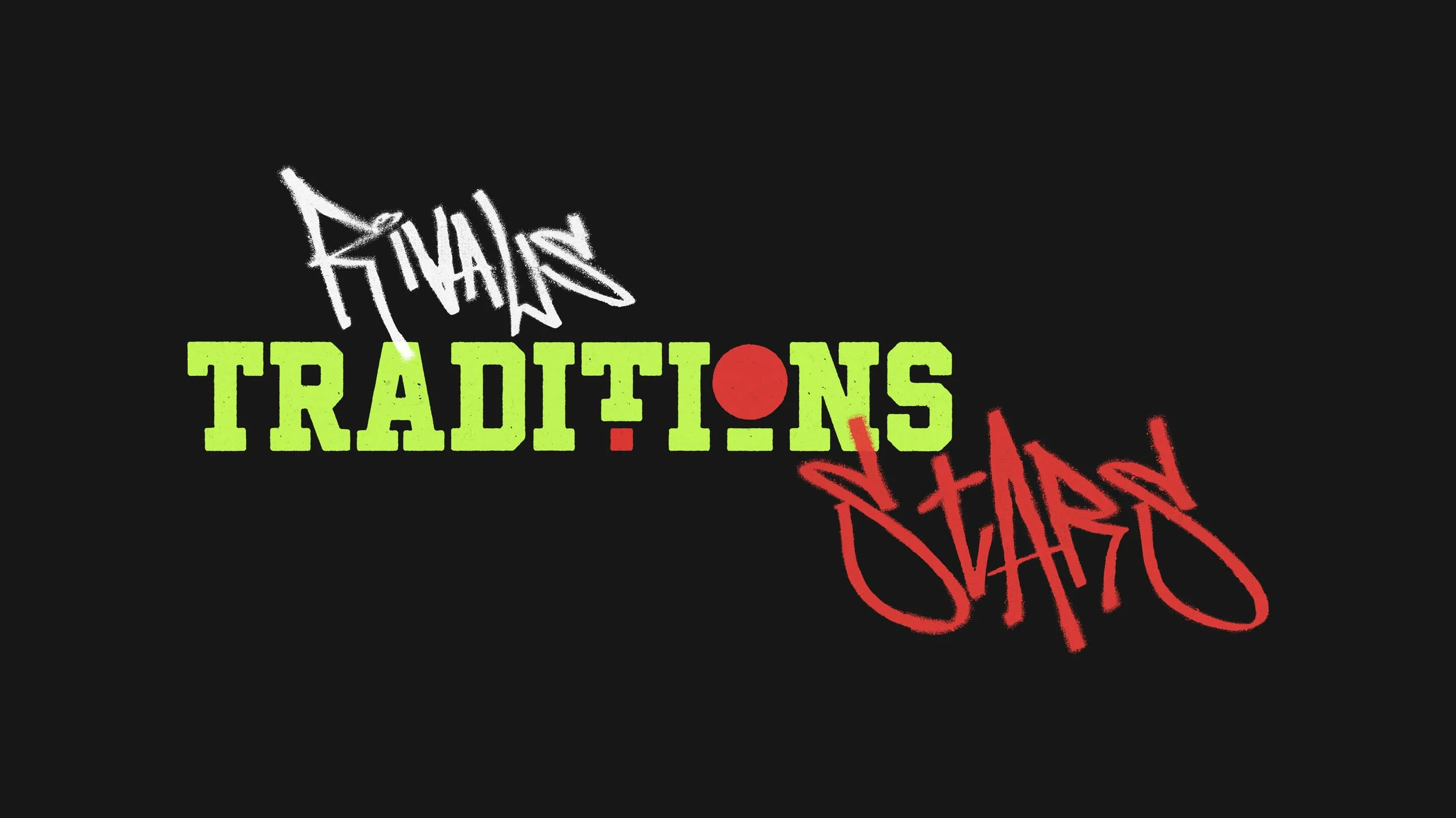
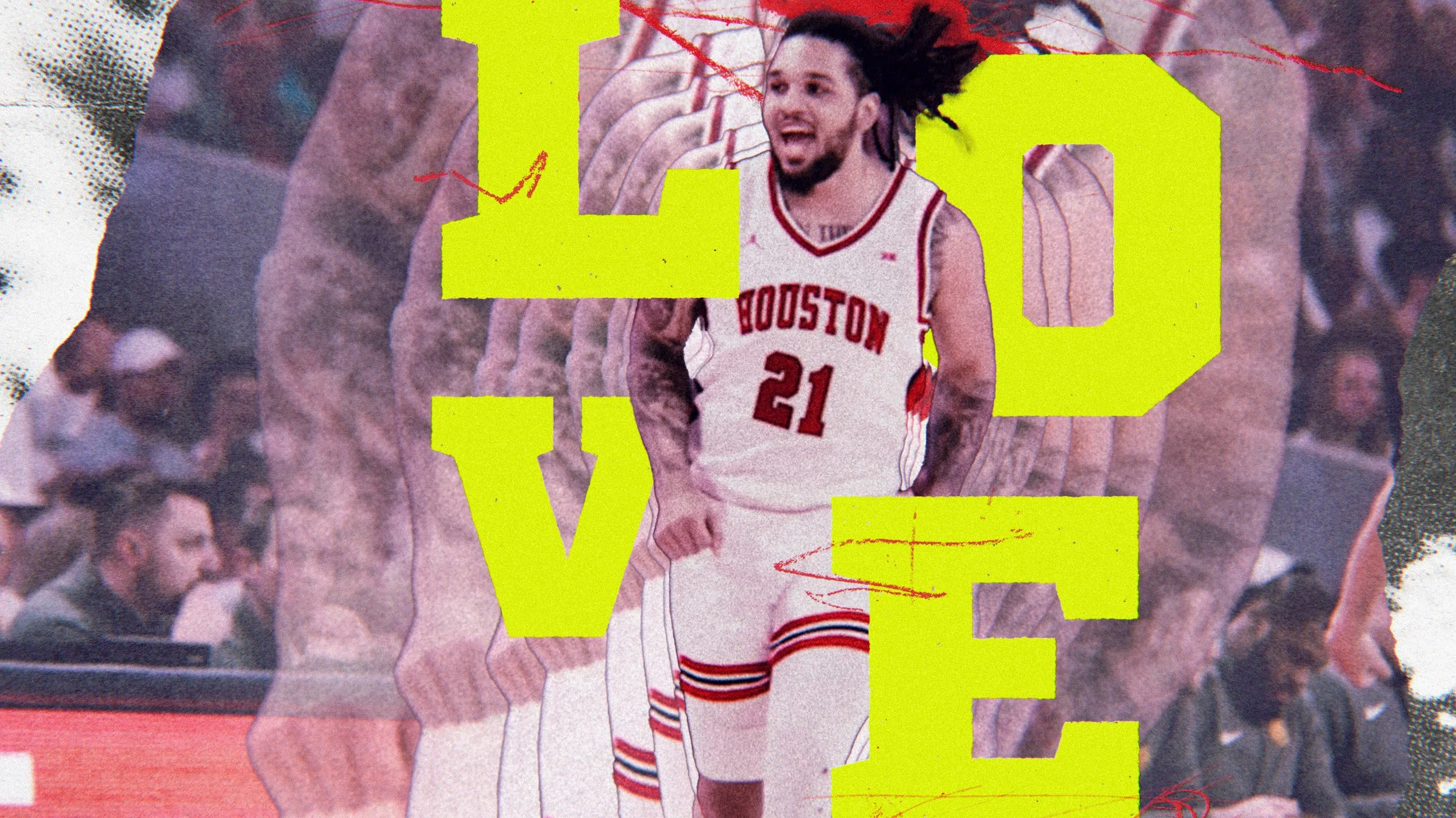
The client was dead-set on a graffiti-inspired aesthetic, so I leaned into the vibe, binged some Fresh Prince, and went to town. I wanted to capture that specific blend of raw street art and texture. What you’re seeing here is just a small sampling of the explorations—a “greatest hits” of the sketches and styles that came out of that deep dive into 90s street culture.